WHAT IS 'NEW OBJECTIVITY' AND 'PICTORIALISM'
'New Objectvity' is a new approach to photography that focuses on capturing the objective world as it is, whereas expressionism, the traditional type of photography practices more abstract and romantic photography. 'The New Vision' has been introduced in the 20th century as a response to expressionism and it is is a whole different visual perspective where people have moved on and developed a new era of photography which influenced many successful photographers like Jaromir Funke or Edward Weston. Artists and photographers broke the gateway between the ordinary and unordinary by having an unique mindset and vision that disturbed the world of Pictorialism.
'New Objectvity' is a new approach to photography that focuses on capturing the objective world as it is, whereas expressionism, the traditional type of photography practices more abstract and romantic photography. 'The New Vision' has been introduced in the 20th century as a response to expressionism and it is is a whole different visual perspective where people have moved on and developed a new era of photography which influenced many successful photographers like Jaromir Funke or Edward Weston. Artists and photographers broke the gateway between the ordinary and unordinary by having an unique mindset and vision that disturbed the world of Pictorialism.
AENNE BIERMANN
|
|
Bauhaus, 1920s |
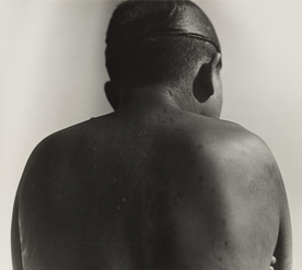
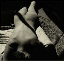
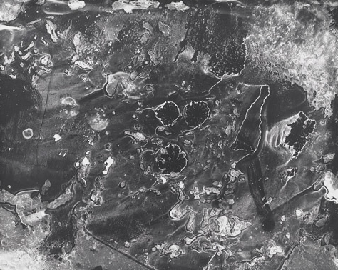
Aenne is famous for her '60 fotos' and there are a few examples above. Her photos make her the central figure in New Objectivity photography because she has a different perspective and her images are unique and each and everyone of them carry a different meaning. Her photographs often contain a main focus in the centre but it is quite different in every image, even though most of them show a part of a human being. I like her style of photography because her images are high in contrast, so even though they are plain, the contrast and shadows build up an eye-catching and pleasing gallery. My favourite one is the the last image titled "Bauhaus". It is a naturalistic photograph and it brings a depressing feeling. The position in the photograph might suggest sadness or that she isn't happy with life because she almost looks dead the way she is laying on the bed. I would guess that she might have been stressed beforehand and she is looking for a way to relieve her anger and bothers. Although she looks depresses because of her head posture, she looks relieved because she has no clothes on and she is in a position where she doesn't have to rely on anything.
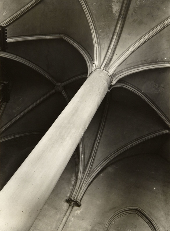
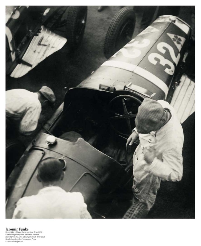
JAROMIR FUNKE
|
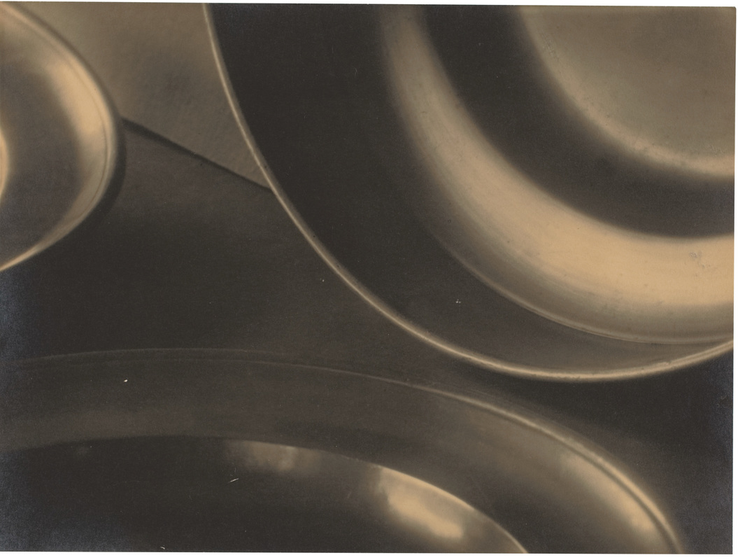
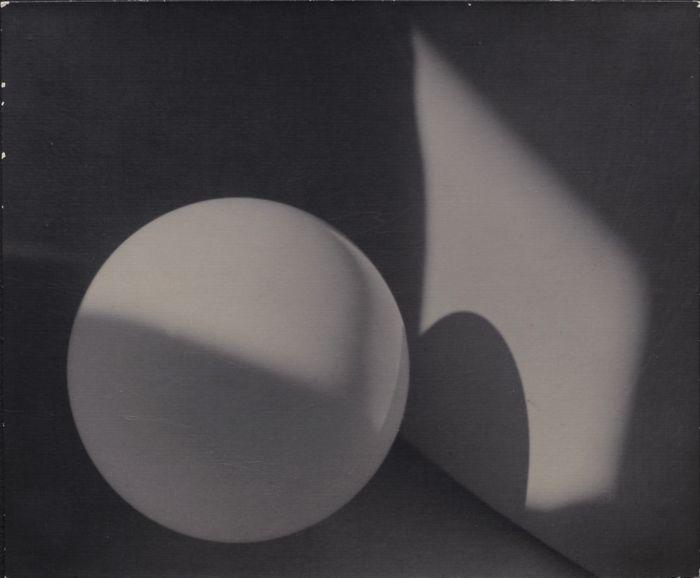
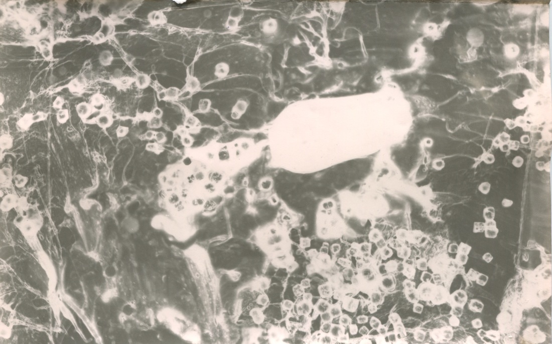
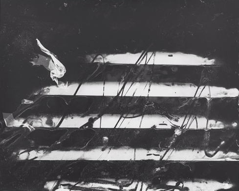
Jaromir Funke is a famous Czech photographer who was inspired by Cubism and the abstract and fragmented form of photography and art. Jaromir came out with a book where he photographs various different surfaces ( human skin, a plant's structure, the surface of a river) .
|
|
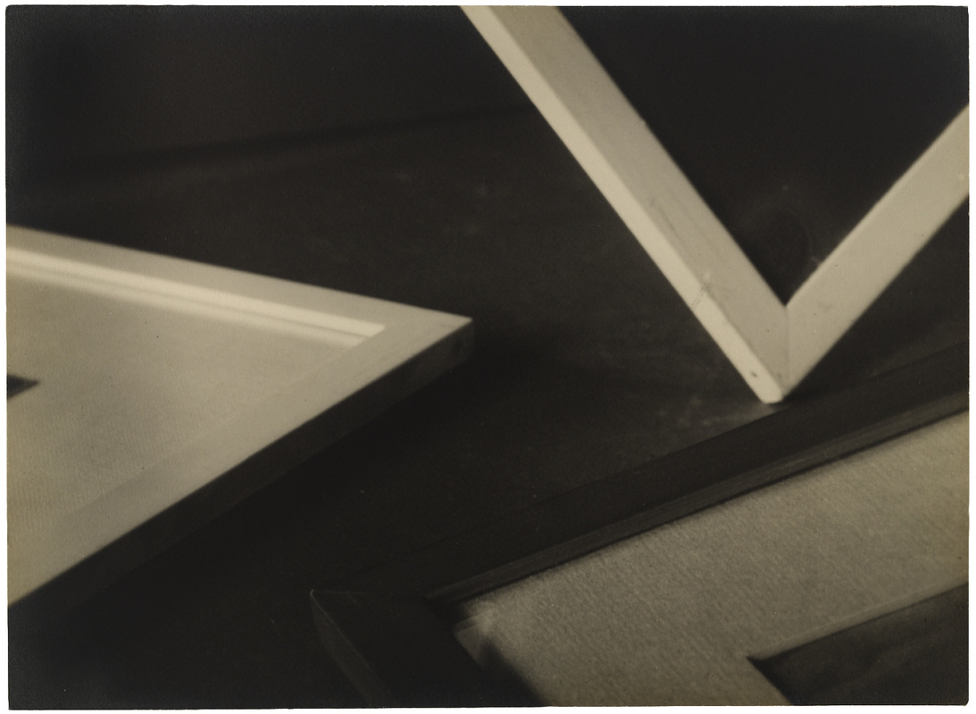
EXPLORING DIFFERENT SURFACES
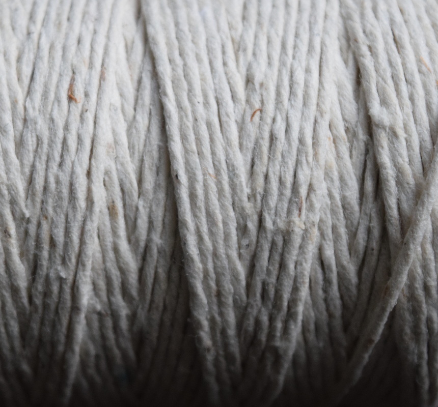
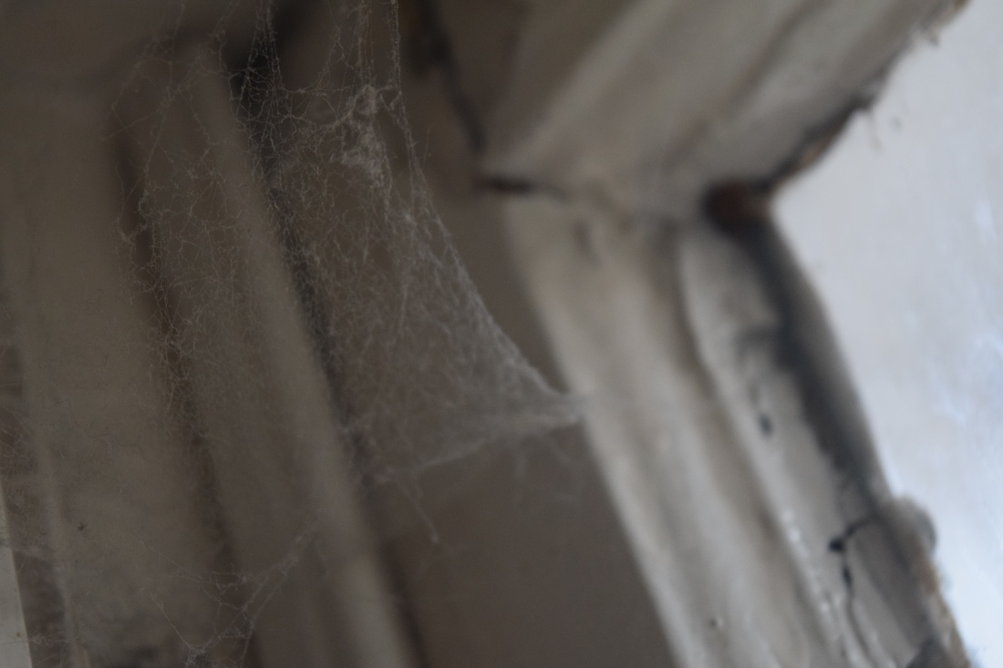
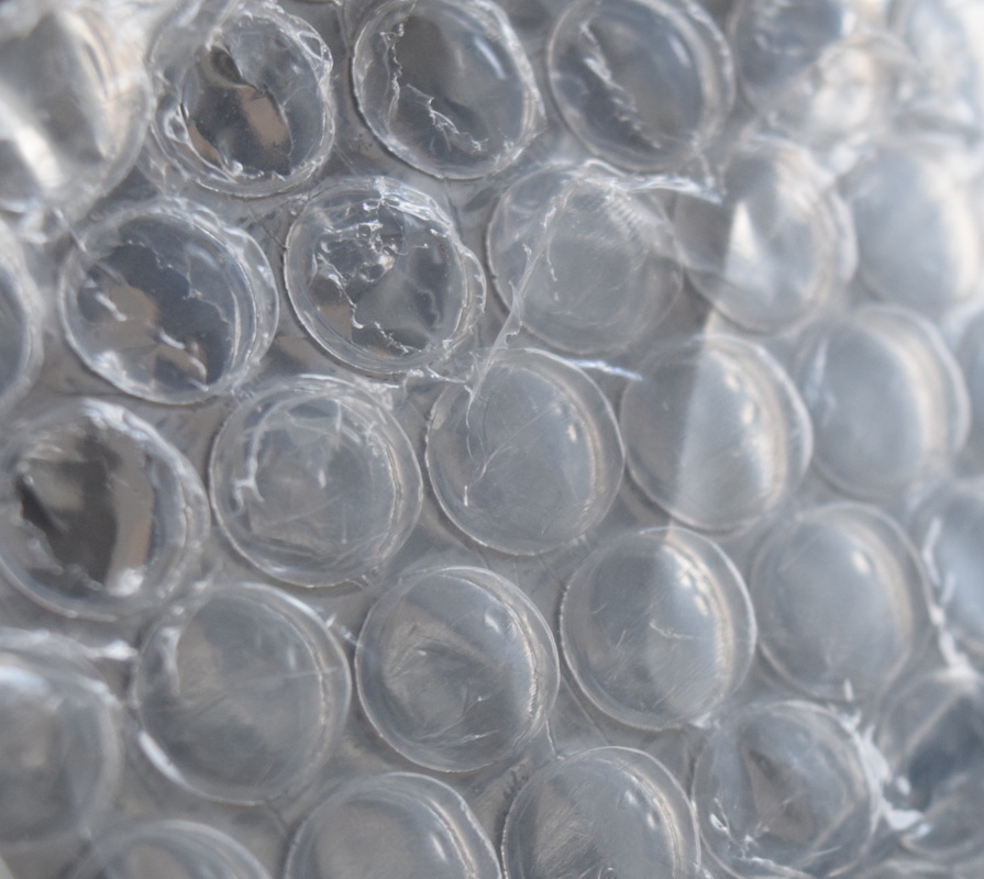
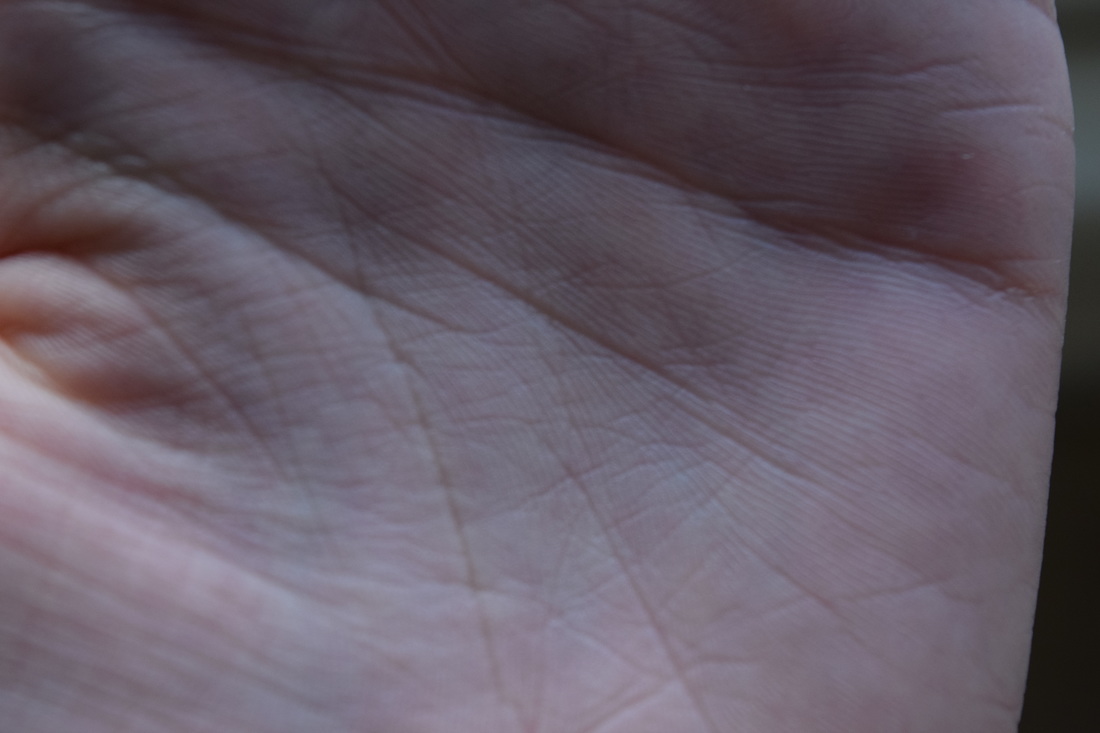
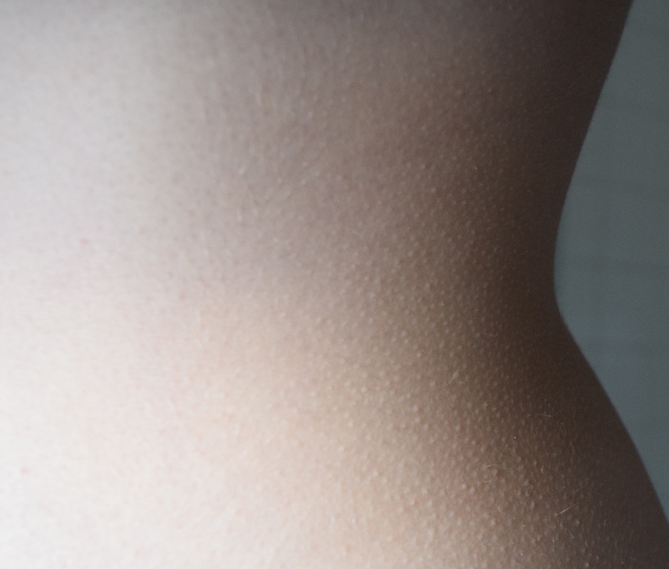
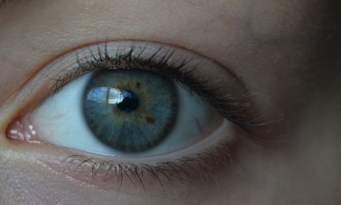
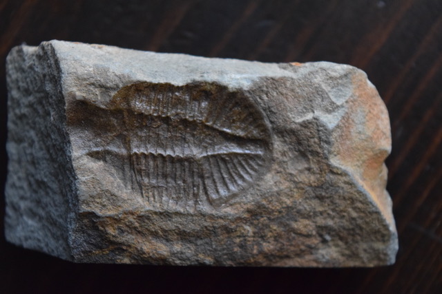
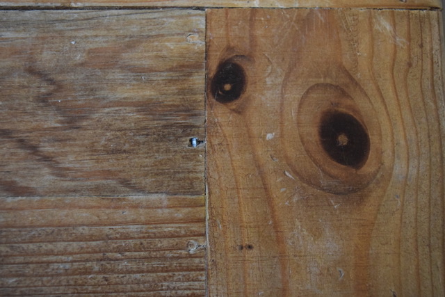
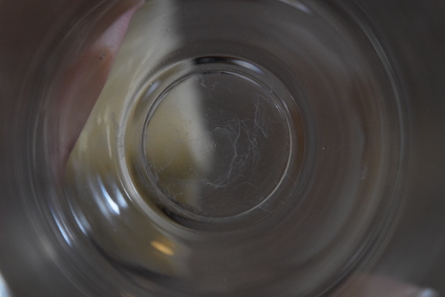
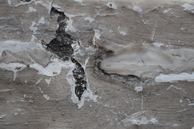
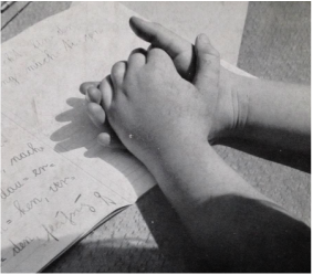
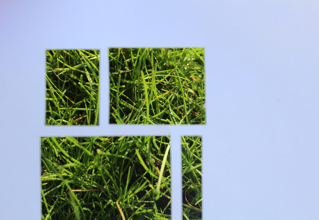
I was inspired by Aenne Biermann while taking these photos because i like her style of keeping it simple but interesting at the same time. I choose to include these pictures because they all represented a different texture of a surface. If you run your fingers through these objects in real life, they would all have a different feel; silky smooth, harsh, soft, rough and wet. The tones and the colour of the images compliment each other because they reflect off each other (reflection from eye, reflection from glass). I took close ups of and the images themselves aren't busy so they all go well together. I like the variation in tone; some pictures are high in contrast, whereas others have a soft and gentle feel to them which could also describe how i would visually comprehend these surfaces.
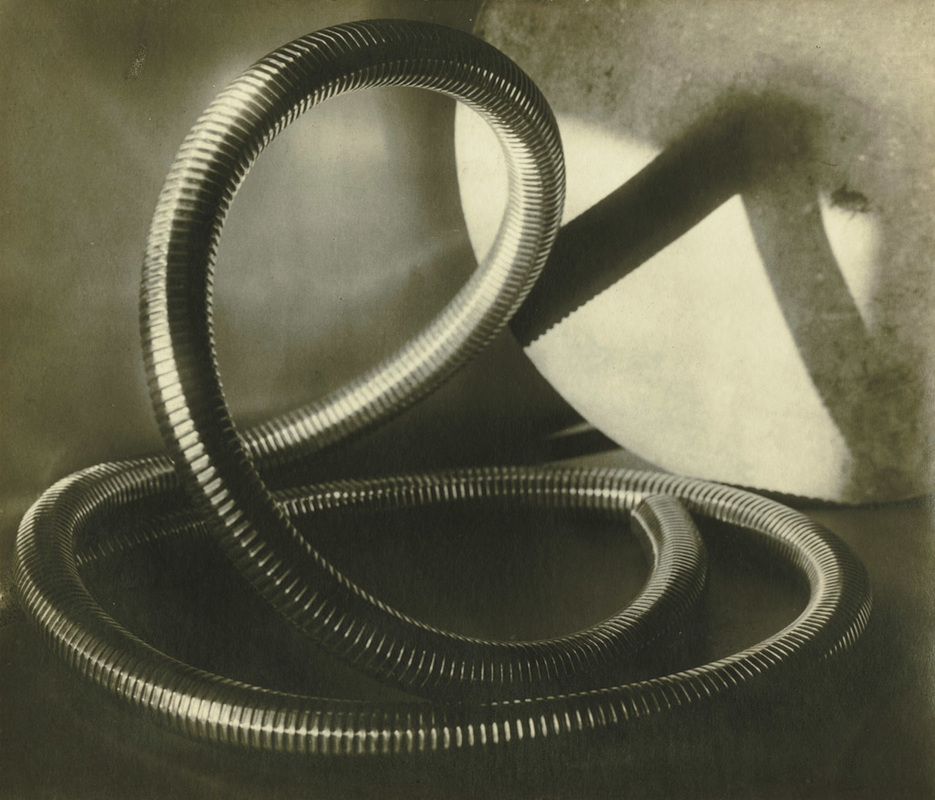
RESPONSE TO THE SURFACE OF THINGS
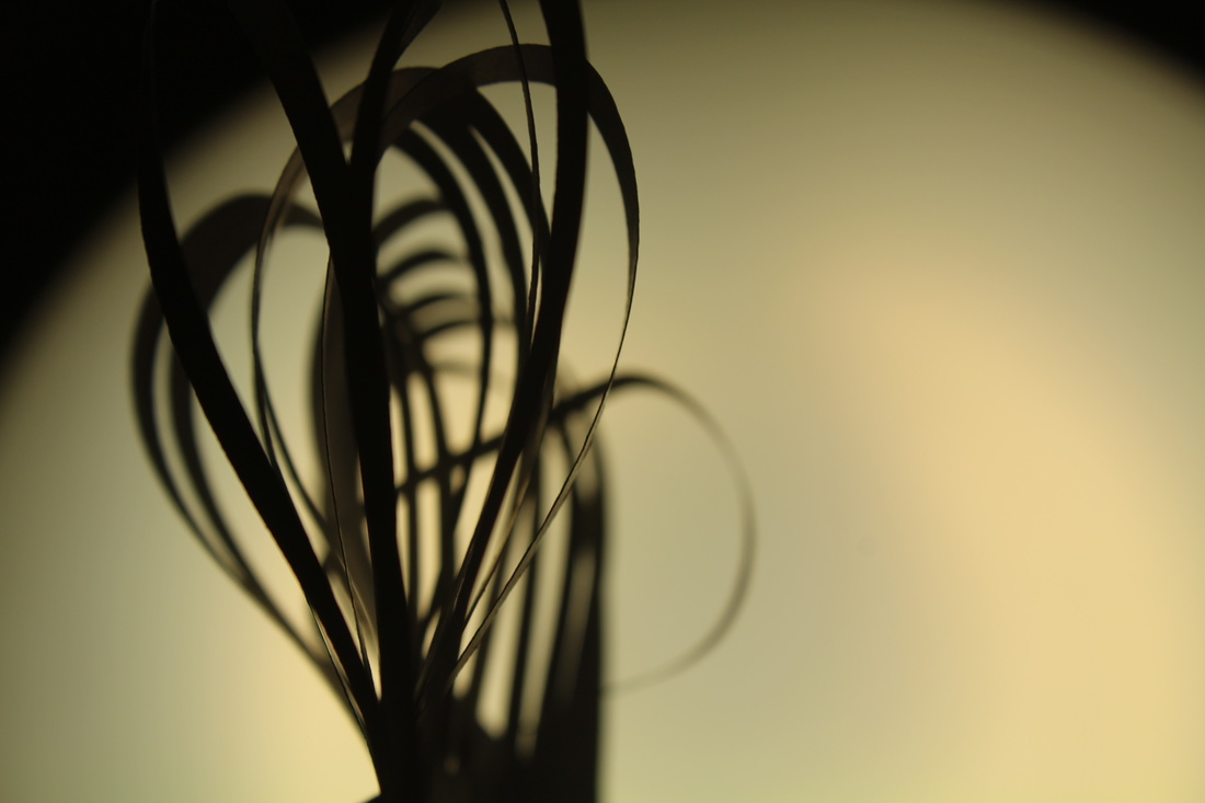
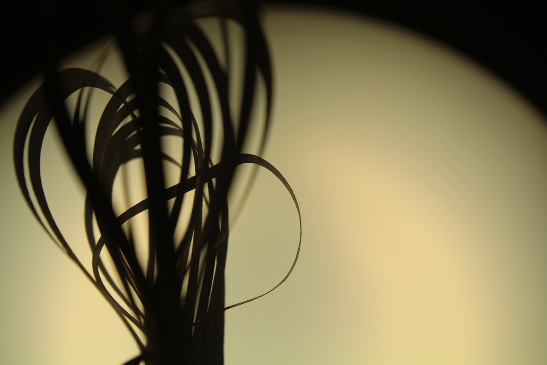
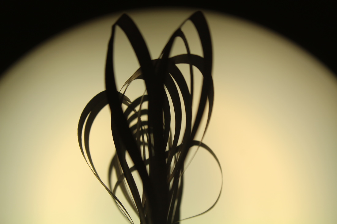
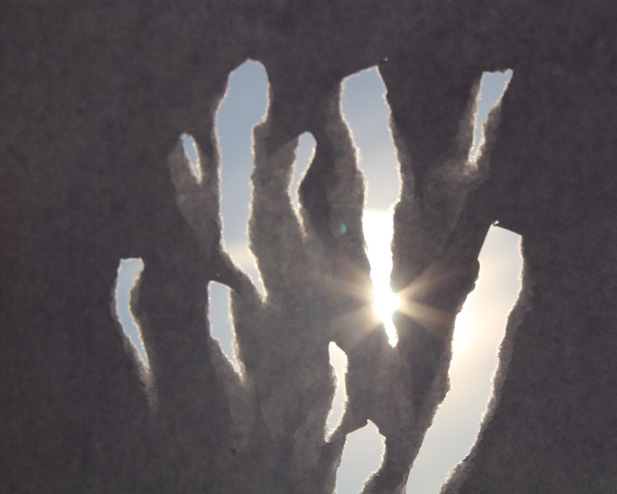
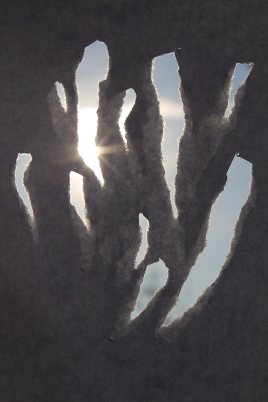
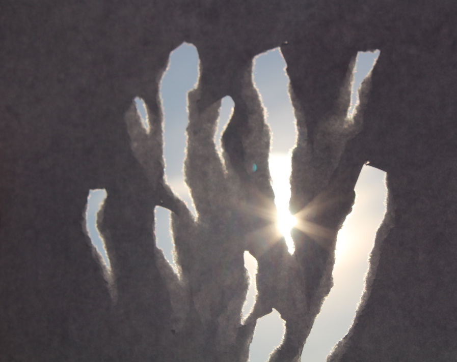
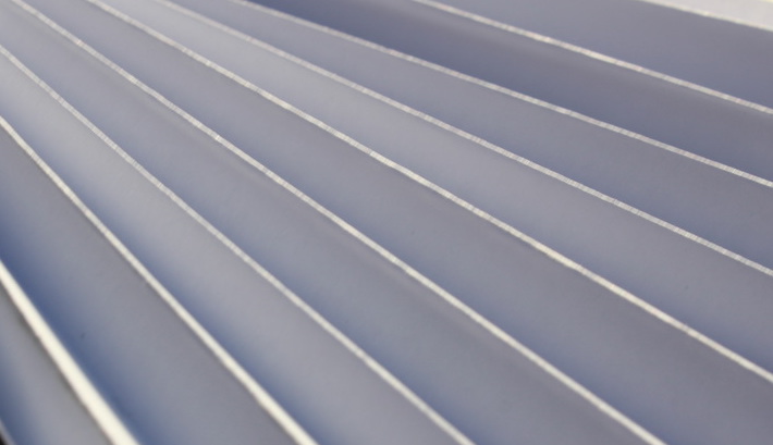
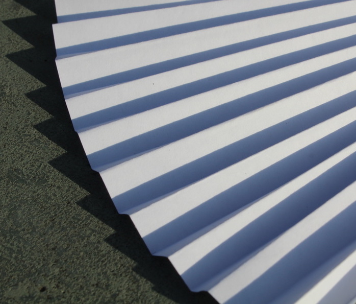
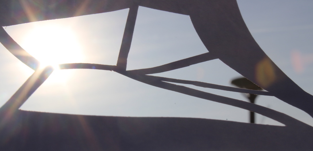
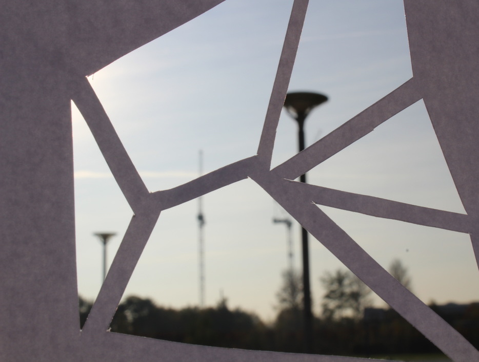
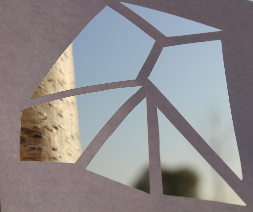
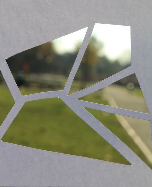
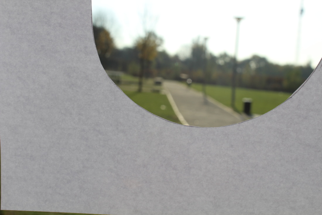
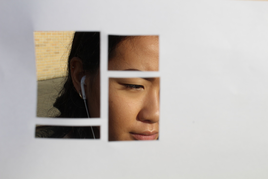
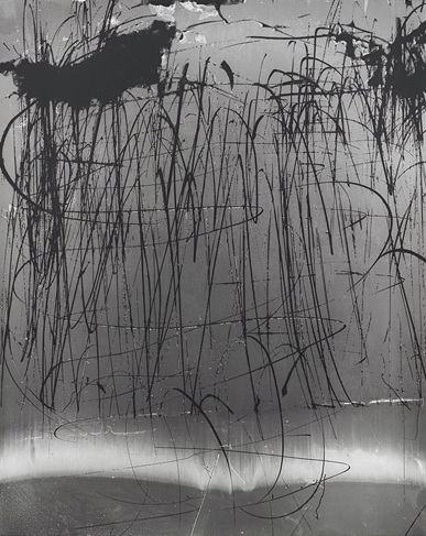
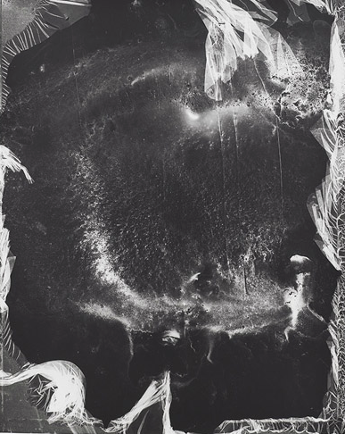
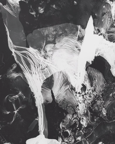
Our task was to make viewfinders that allowed us to explore different textures and surfaces. To create the first set of 3 images, i cut paper and folded it so it was bouncy and stringy. The sculpture was boring itself but i decided to place it in front of a big light source so it would change colour and become unrecognisable. The first set of images is my favourite because it looks abstract but it still explores different surfaces because of the high contrast between the sculpture and the shadows.
CRITICISM AND EVALUATION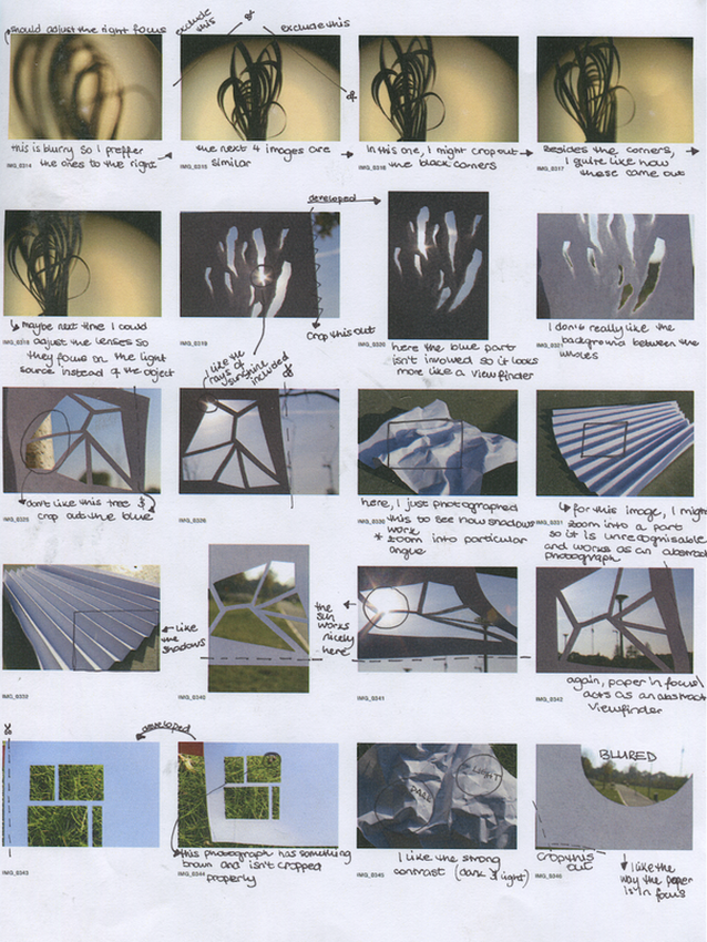
|
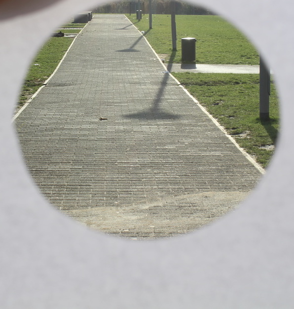
I decided to criticise my own work and pick out the things I think worked well and mention what I would change to improve them. A lot of my work needs cropping out and in some, i would only choose a certain area where I think the contrast between light and dark has worked very well to portray the surface of it. The shadows are also contributing in making this gallery of photos successful because it makes the "sculptures" stand out and it looks more realistic which is the point since 'New Objectivity' focuses on capturing the world as it is.
|
MANIPULATING 'NEW OBJECTIVITY' PHOTOGRAPHS TO GET DIFFERENT TEXTURES
Letha Wilson |
David Benjamin Sherry |
Eileen Quinlan |
David Benjamin Sherry |
|
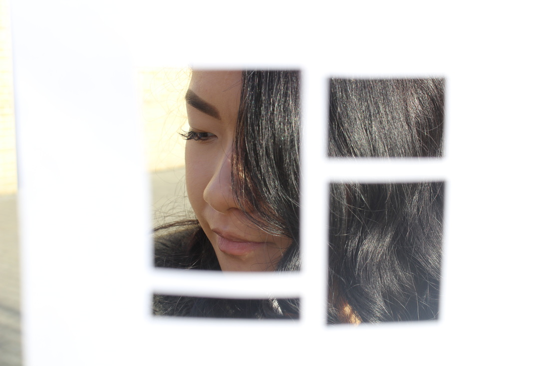
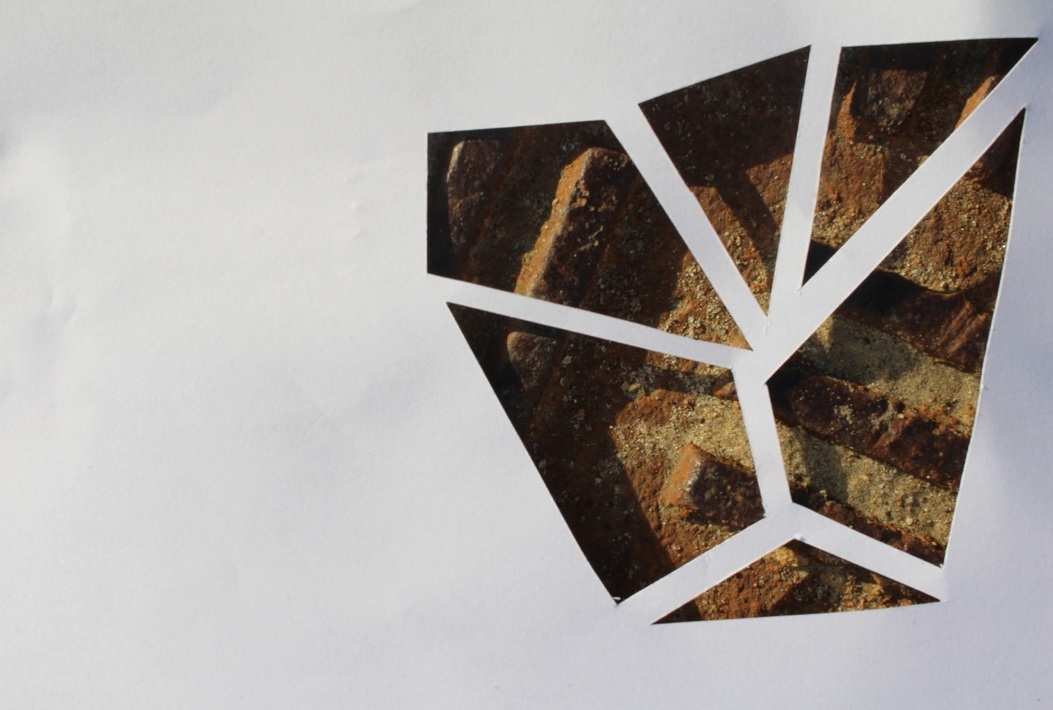
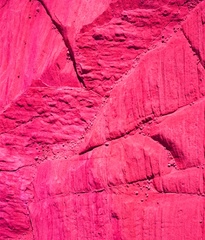
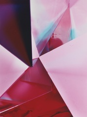
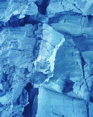
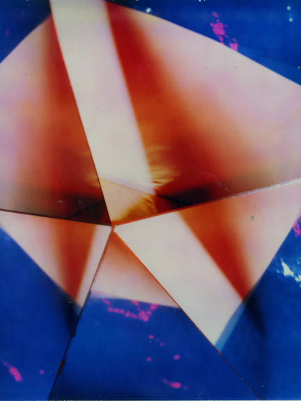
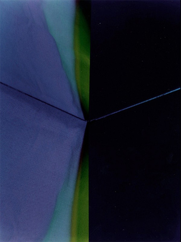
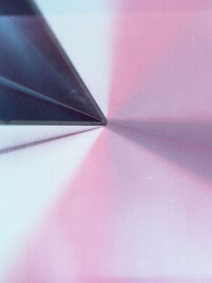
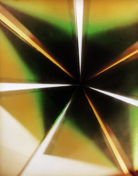
Our task was to take already made photographs by some famous 'New Objectivity' photographers and to disrupt the images by changing their surface texture. After doing this we thought about why we did what we did, what made us decide to rip, tear or cut the images. The first image with pink tones was decided by different shades and you could see a clear contrast of when another colour was beginning, so I decided to cut them up and dismantle them and place them in a different order so the frame of it has a different, more abstract form. On the second piece, there were two images that looked very similar, but the only visual difference was the colour- pink and blue. I decided to tear a imperfect circle and stick it on the blue. The original idea was to cut it so it blends in the blue picture and it looked like a single photograph that was slightly manipulated with changing the colour, but when I ripped it, it had a nice white outline that was visually appealing so I left it as it is. |
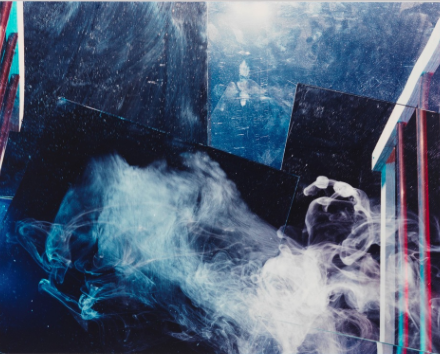
EILEEN QUINLAN
Eileen Quinlan is a contemporary photographer who who plays a big role in 'New Objectivity' because she is finding new ways of expression and photography. She is famous for creating abstract images by capturing various objects on reflective surfaces which result in interesting photographs like these bellow.
SLIDES
|
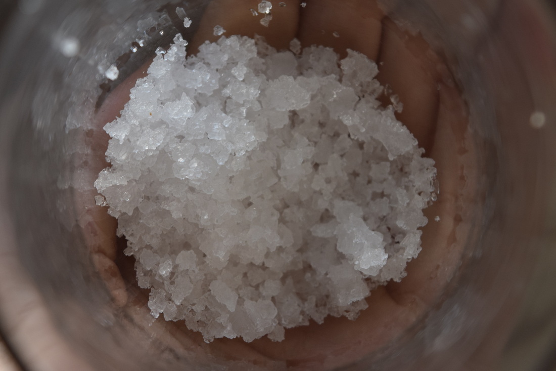
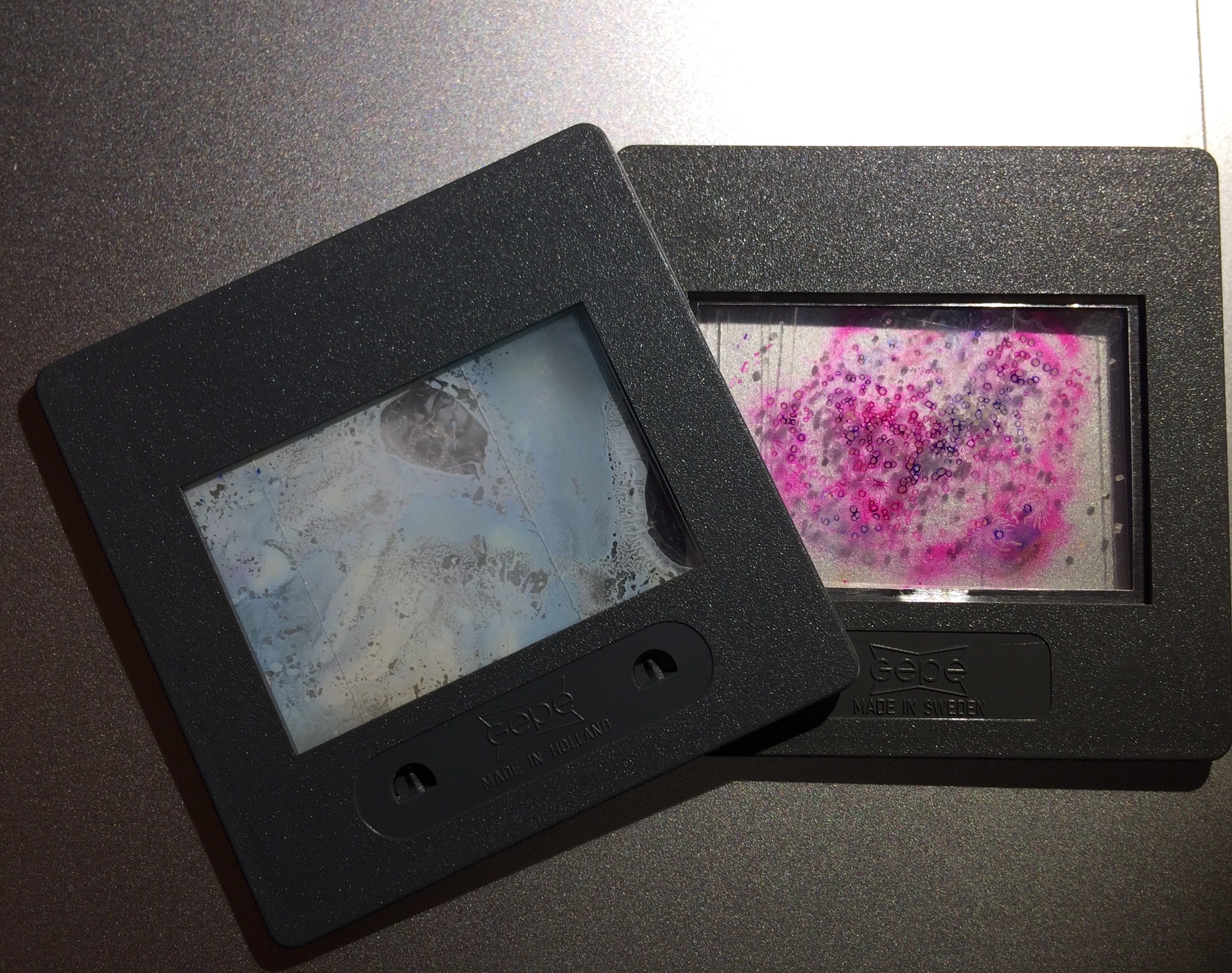
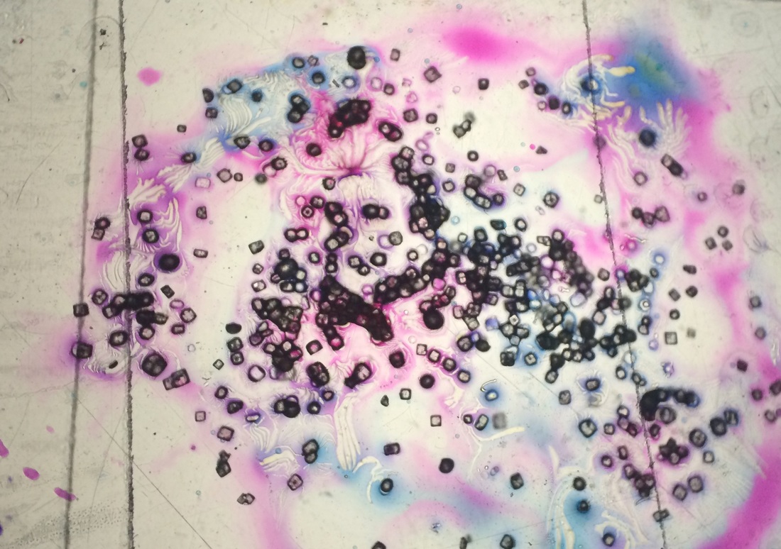
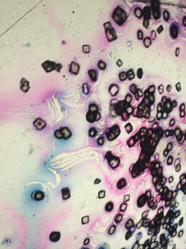
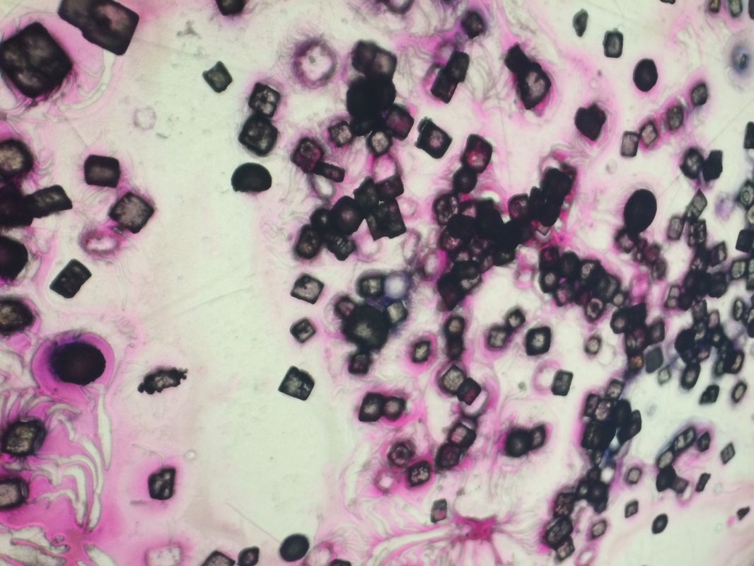
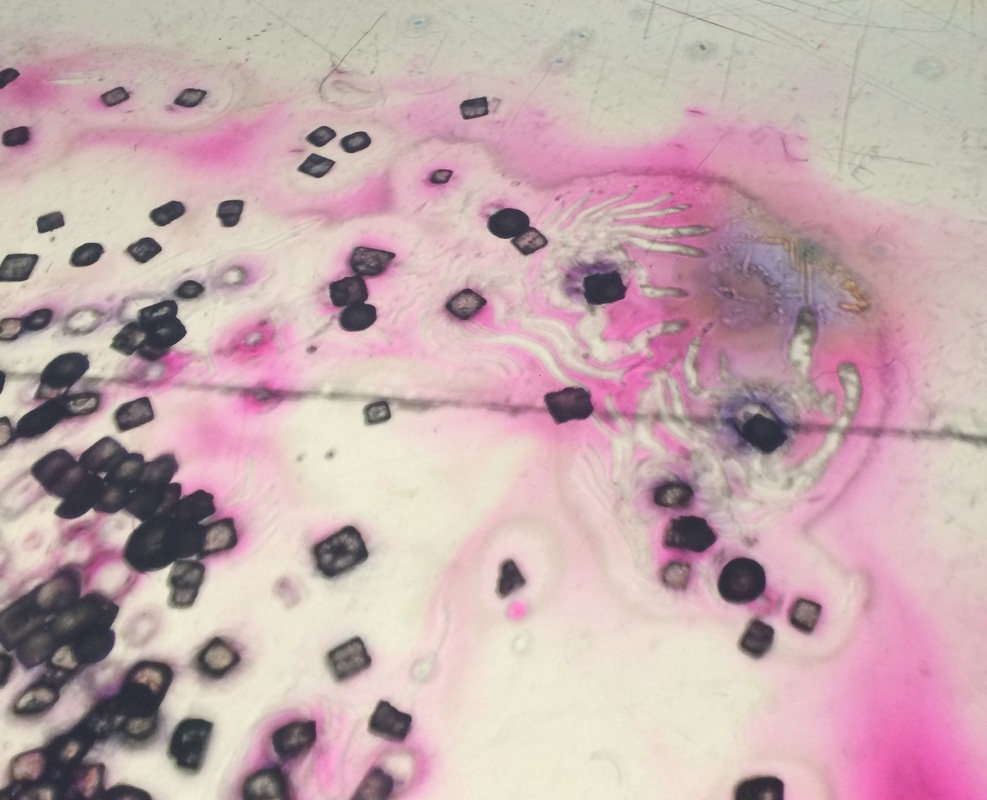
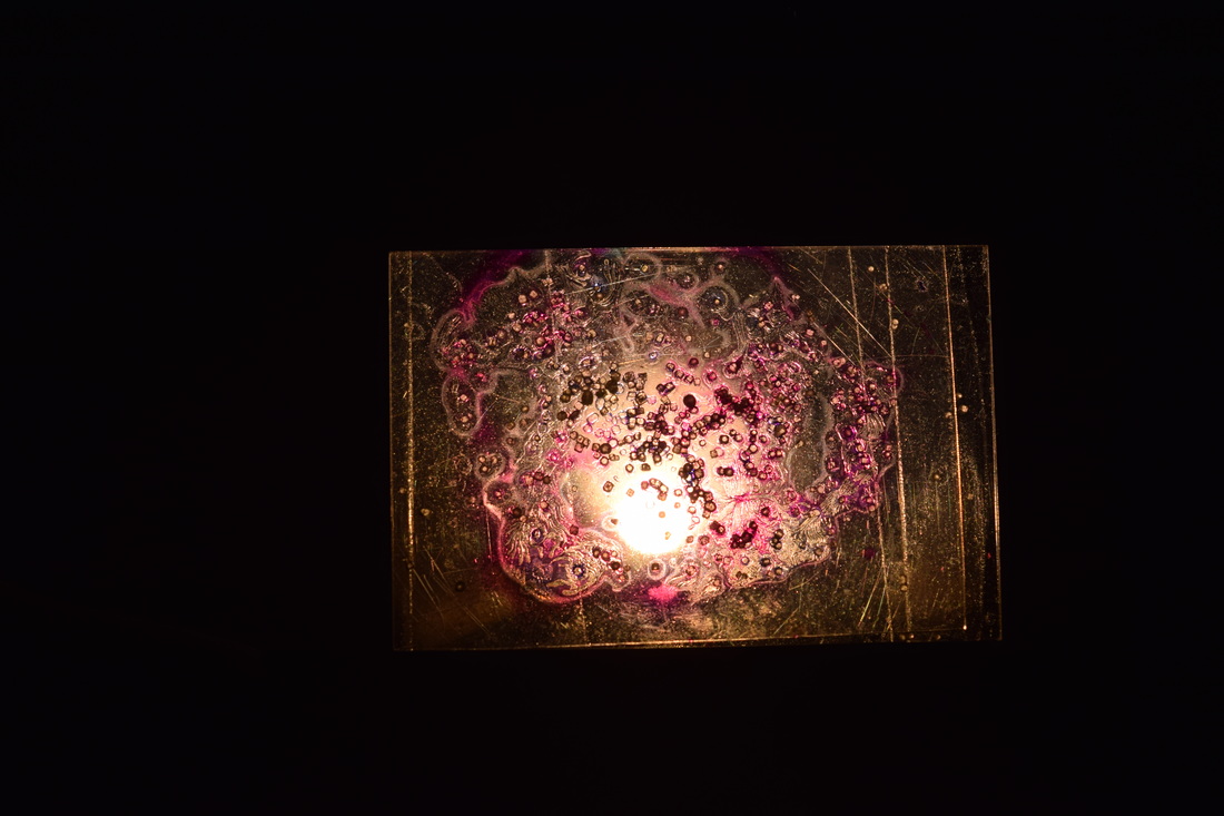
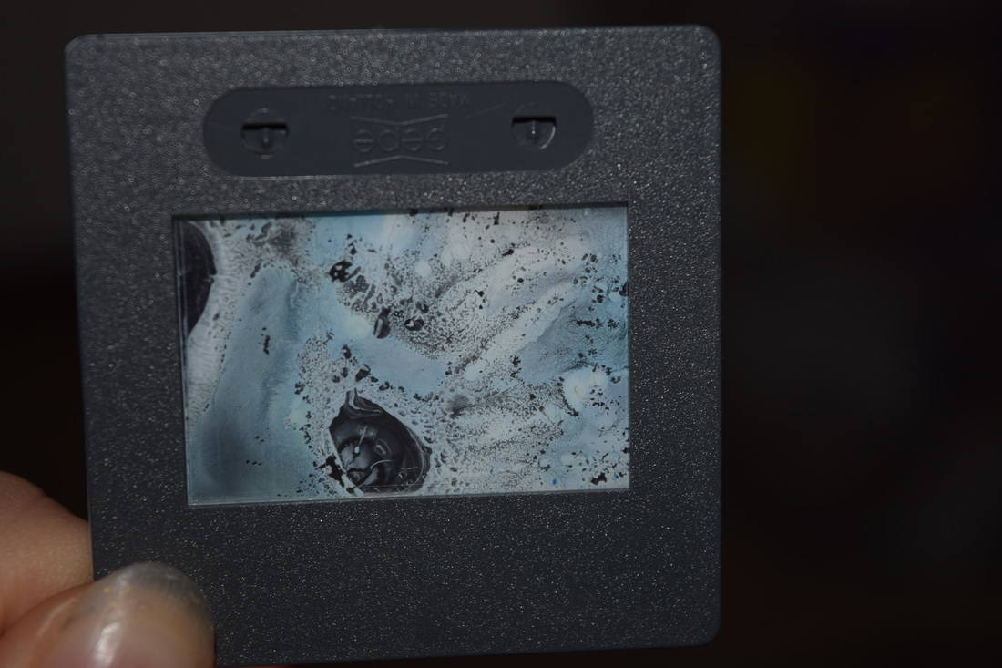
In between two tiny pieces of acetate, I sprinkled salt and carefully distributed pink, turquoise and white ink on to one sheet and covered it with another. For the first slide, I was spending a lot of time thinking about how the ink looked, but i didn't realise that the other piece of acetate would disturb it's placement. I still decided to use it and it came out better than i expected because when projected and viewed in a bigger scale, you can clearly see the detail of the two colours of ink collaborating and complimenting each other.However, next time I am creating a slide, I am going to use less ink so there are some blank patches and maybe put a different liquid to get a different outcome. I like the effect the salt leaves when enlarged because it is see-through, but not completely because it is still visible to an extent where you can identify the outline of the salt molecules.
|
EXPERIMENTING WITH SLIDES
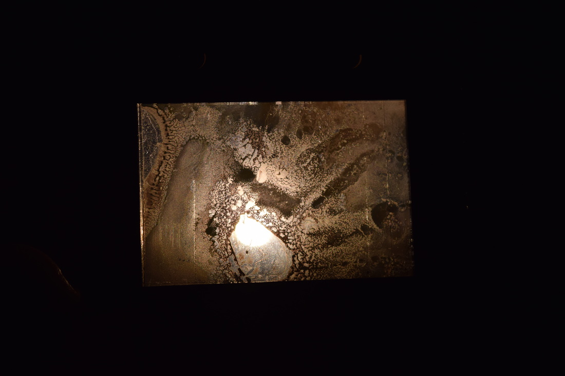
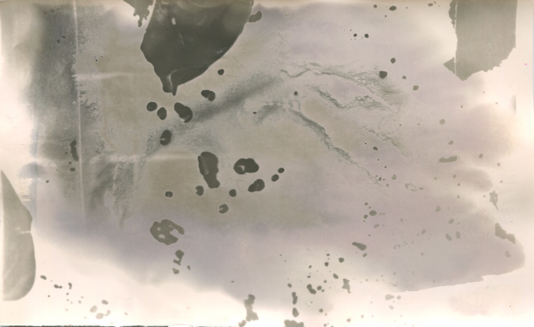
In between two tiny pieces of acetate, I sprinkled salt and carefully distributed pink, turquoise and white ink on to one sheet and covered it with another. For the first slide, I was spending a lot of time thinking about how the ink looked, but i didn't realise that the other piece of acetate would disturb it's placement. I still decided to use it and it came out better than i expected because when projected and viewed in a bigger scale, you can clearly see the detail of the two colours of ink collaborating and complimenting each other. However, next time I am creating a slide, I am going to use less ink so there are some blank patches and maybe put a different liquid to get a different outcome. I decided to take a step further and experiment with the slides, so I took them into the dark room and exposed them on light sensitive paper. They came out differently then how they did when projected, but they were equally as interesting.
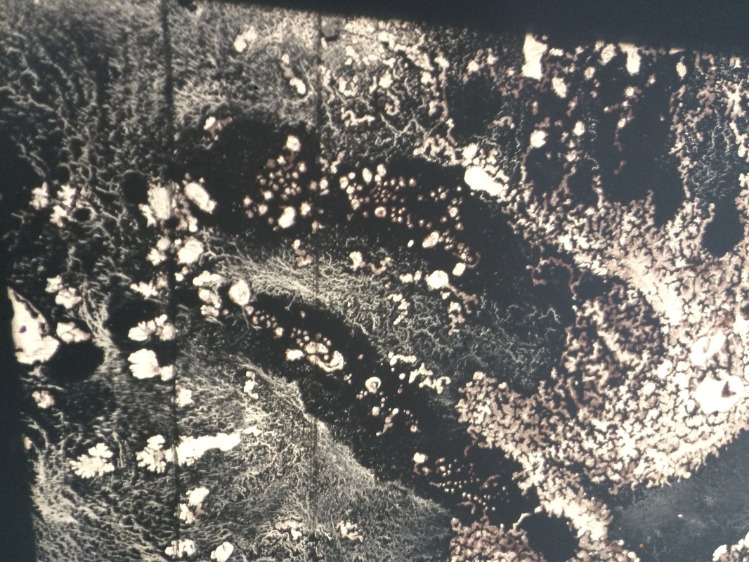
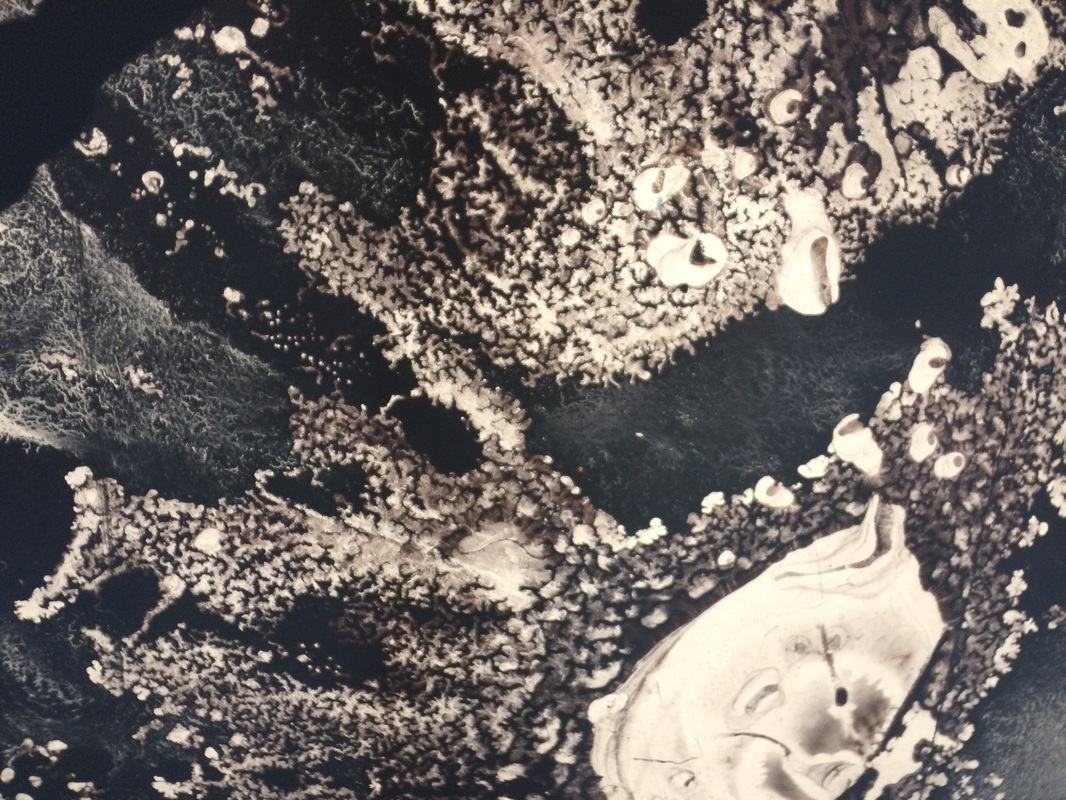
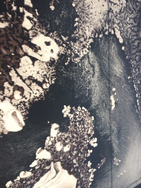
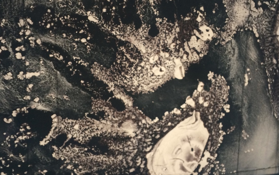
EILEEN QUINLAN: CURTAINS
Eileen Quinlan is a photographer who has focused mainly on the abstract, bright and colourful 'in your face' photographs, but here in her curtains series, she moves away from her usual style and develops a different compilation of black-and-white prints. She uses camera-less photography to create all her images while also making scratches on the surface of her paper which create an interesting and unique texture. Some of her images look like she used the technique of exposing a slide on to photographic paper and i responded by using a range of different substances on acetate and developing them in the darkroom, which would look similar to Eileen's work.
COMPARE AND CONTRAST
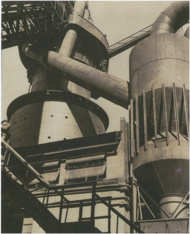
Charles Sheeler - For Plant, River Rouge Blast Furnace and Dust Catcher. 1927 |
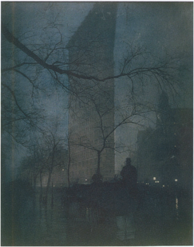
Edward J. Steichen - The Flatiron 1904, printed 1909 |
|
Charles's image relates to the 'New Vision' because it is capturing the world as it is. The photograph is clear and high in contrast since which reassures us that the image is in fact real and hasn't been manipulated. Unlike Edward's soft touch to the image (makes the building unnoticeable at first glance), Charles likes to show it as it is; geometric, symmetrical, big and overwhelming.
|
Edward's photograph is associated with Pictorialism because it almost looks as if has been painted. The photograph looks depressing and dull since there is very little light while the dominant colour is a dark navy blue. As well as the dark colours working together, the way the photograph is faded creates an illusion that takes us away from reality. In contrast to Charles's photograph, Edward's one is less clear and you can't make out every detail in the photograph. The objects in this photograph are improper (the branches), whereas everything is constructed and bold in Charles's image. Both images contain something man made (buildings), however Edward's photograph has a more natural feeling since it is fulfilled with trees that are surrounded by a blue sky.
|
