HISTORY OF THE PHOTOBOOK
Photobooks were once thought of an idea that won't go far, but in fact, textless photo books are revolutionary. It is not only about the feeling of owning a photobook and being able to open it whenever you like, but it is good to have because, as a photographer, you might develop some ideas from that you've been inspired by from the book full of visual elements. It is just as easy looking up photographs digitally, but there is a huge difference of viewing it on a screen and actually physically holding the book in your hands and flicking through the pages. I personally appreciate photographs more when they are printed out because it is right there in front of you. In a way, it feels like you are more interactive with a photograph or photo book while it is physically in your hands. Having or creating a photo book might give you a different perspective on photography. It isn't just one photograph working by itself, but a collection of images that must collaborate and work together. Even when text is involved, every action has a meaning, so where you place the text and how you decide to frame and layout the images all has to have a meaning and explanation behind it.
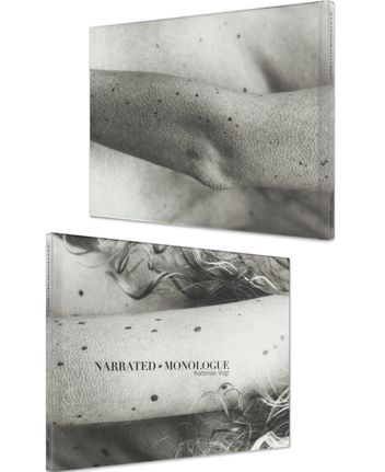
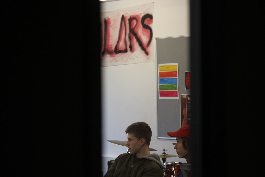
Korbinian Vogt - Narrated Monologue
|
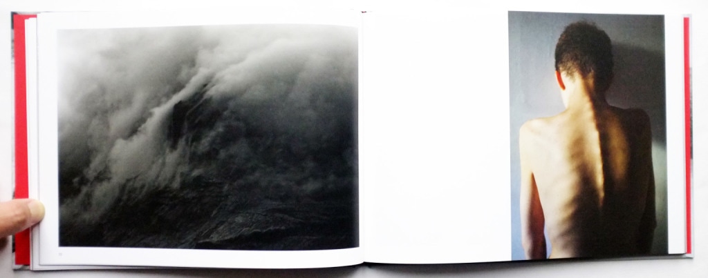
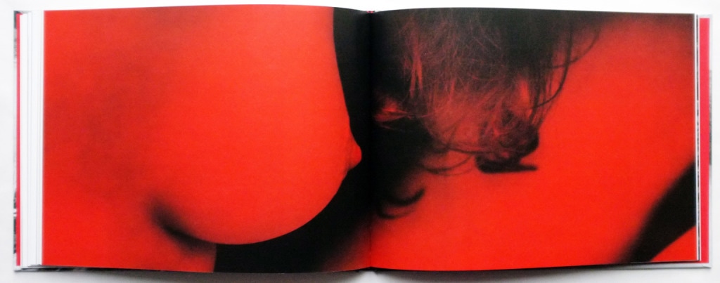
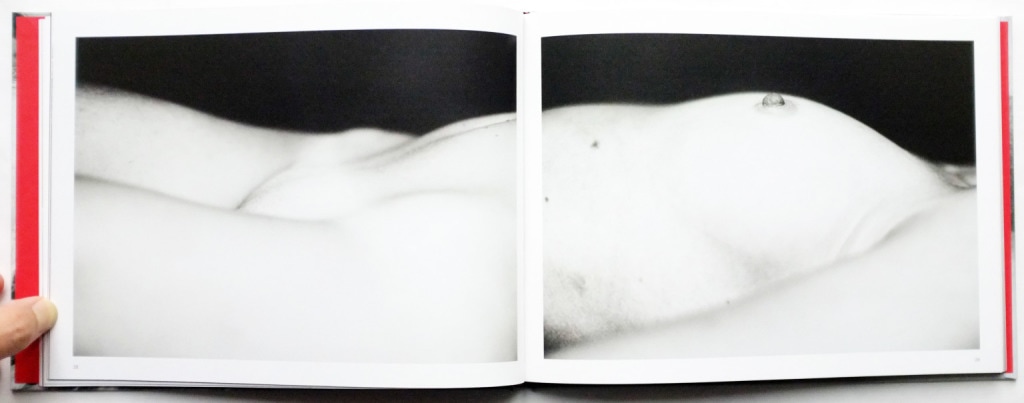
The back and front cover are probably the two most important photographs that will be in a photo book. Those images are going to be presenting the whole book and they are the ones that are either going to catch peoples attention, or not. I like Korbinian's front and back cover photographs because they represent what the book is going to be about and what we should expect. It doesn't give too much away by being black and white, but it gives us just enough to want to know more. Korbinian's book has a written form of what the book is about and it is talking about capturing the beauty around us. He photographs women's and mens bodies, beautiful landscapes and body close ups. It represents feelings, relationships and friendship- interactions with himself. In his book he has a few diptychs and they all work well together. He has combined spreading one image across two pages with using diptychs. He decided to divide some single images with a line in the middle, but with others he decided to make two pages look like one.
|
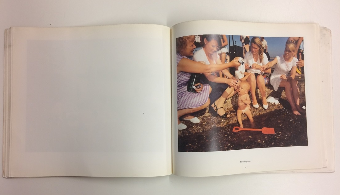
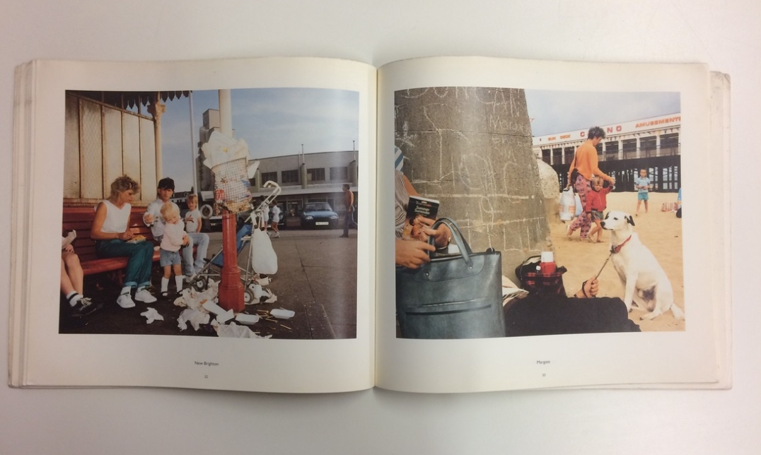
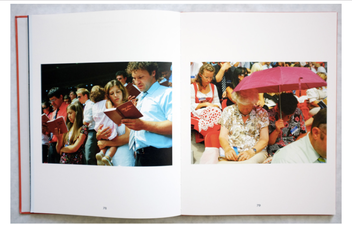
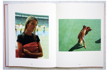
MARTIN PARR
The idea behind the series of images presented in the book 'Home and Abroad' is to capture the working class in their every day conditions, but the spirits of the people and vibrant colours brighten up the images. This photobook was published in 1993. and it reminds me of Nick Wapplington Living Room series because they both have uplifting and bright colours, as well as capturing very natural actions of people, as if they don't even know the camera is pointing at them. Most of the images in this book have families and a lot of children in them which symbolise happiness and playfulness and I think Martin captured these moments well.
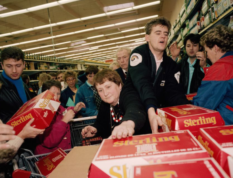
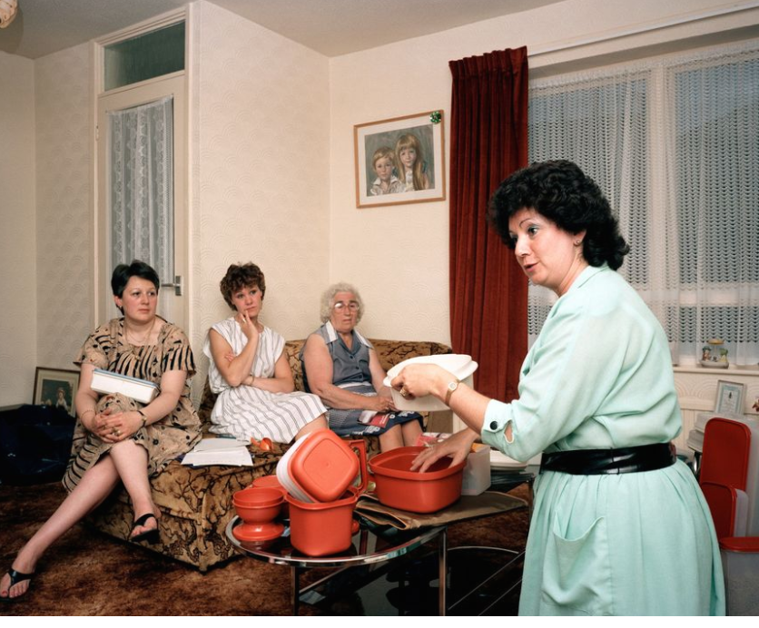
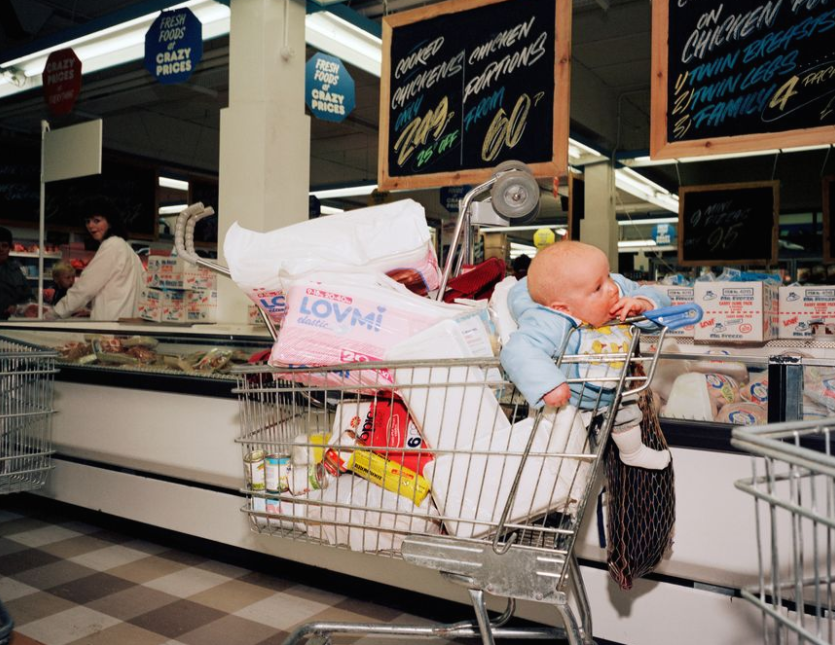
This photobook has a great layout. I love the way he positions photographs because he puts two images on separate pages, but he thinks about which ones would go well together. I noticed that he would leave to blank pages next to very busy images which clearly shows that he put thought into the layout because the photograph works nicely by itself.
KURT DERUYTER- HALFWAY HOME
Kurt is a well known photographer who enjoys capturing subjects such as urbanisation, nomads, anthropology, migration... He uses film and I really like how his pictures turn out. His photographs are clear and slightly washed out whereby everything is white, but the intense bright colours remain and play the main role in the photographs. I noticed he has a mixture of black and white images as well as coloured ones. He also incorporates landscapes, as well as portraits which he says that both subjects clearly show what is happening in the world at those times. I like his layout because he, on some pages in the photobook, puts only one photograph so it goes across both pages but in some he puts only one image on a page, so two pages would in a way create a diptych. Over the easter holidays, I took some pictures and I realised I enjoy looking at youth culture. By looking at Kurt, I feel like I want to do a variety of formats of my photographs and I want to do different things in terms of the layout whereby spreading one image across two pages, but also making diptychs.
|
Kurt doesn't give too much away of his theme and subject through his front and back because he uses the photographs that he includes into his photobook gallery, but he edits them in a way where it looks abstract. I like his covers because they are simple and they have a nice colour to it. |
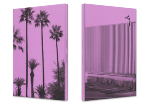
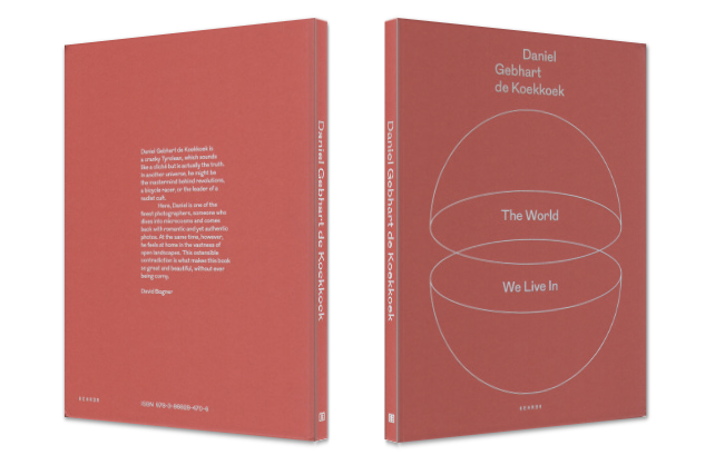
DANIEL GEBHART DE KEOKKOEK- THE WORLD WE LIVE IN
|
Daniel is an Austrian photographer who takes pictures of what he sees and experiences. There is no deeper meaning behind his photobook, he just combines the images and they work well together, visually. I like that he uses intense colour, and his layout is simple and neat which I also like. I think that it's nice that he doesn't have a deeper meaning to what he does because it makes the brain think and make connections which you can personally interpret how you want. His photographs are straightforward and blunt and he is showing us the world as it is. No manipulated cropping or perspectives- it just is what it is. I want to focus on colour because I feel like colour is symbolic of the young generation that represents colourful and different new ideas and I want to show that in my photobook. However, I don't want to use text just like Daniel because it takes away the fun from inventing and interpreting something yourself. Also, Daniel has a theme within his layout where everything is simple and direct, however, I want to experiment and do different things. |
|
This photobook has a very simple, one coloured hard cover. I think this relates to the whole topic and theme of the photobook itself. It has a sphere which could symbolise the Earth and it being split into two, and that could simply just show that the book will literally be about the world we live in. The colour of it isn't intense and pastel, but simple and soft and I like this because usually, you would expect a photobook to have a photograph on the front and back of the covers. I might take this into consideration, but I might use a single photograph on the outside covers of my photobook. |
|
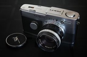
TWO FRAME FILM
|
Two frame film photographs are created via Olympus Pen cameras and they produce two different images on one frame. The original point of this camera was to let people take more pictures because usually, on one role you would have 36 shots, but this way it would bring you up to double the amount. However, over time, when digital cameras were introduced, the camera had a different purpose- creating diptychs that are divided by one thick black line. The point is to combine two images together and make the brain make connections and links between the two.
|
|
LUKE FOWLER
|
|
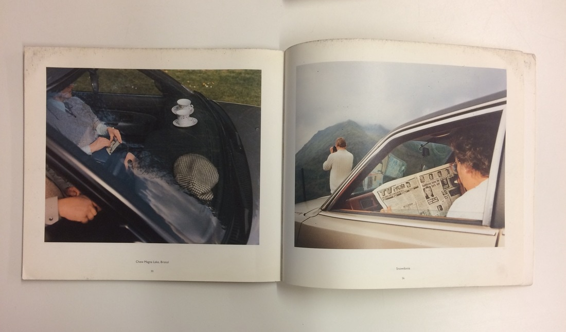
Luke Fowler is a filmmaker that took upon a project of making an amazing photography book full of diptychs that he created with the olympus pen. He said that there is a fine line between photography and film and he questions the reliability of a photograph. He describes his diptychs as film-stills and wants us to make our own story "through combining the chance fragments as exposed by photographs". What's interesting about this type of photography is that the two images were taken one after another (some moments apart, some could even be days apart) and me, as the viewer, would never even know, but I would still try to link them and that's the whole point of his work. I looked at some of his work and I noticed that in some diptychs, he captures the same place but from a different perspective and they work well together because they have similar colours and similar lines. |

Luke obviously selected and photographed two images next to each other for a reason and i think he is doing this to create a new way of thinking and wants people to make their own stories instead of forcefully telling the audience what his intentions were.
|
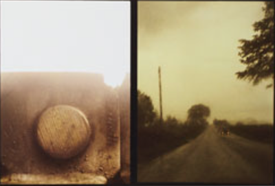
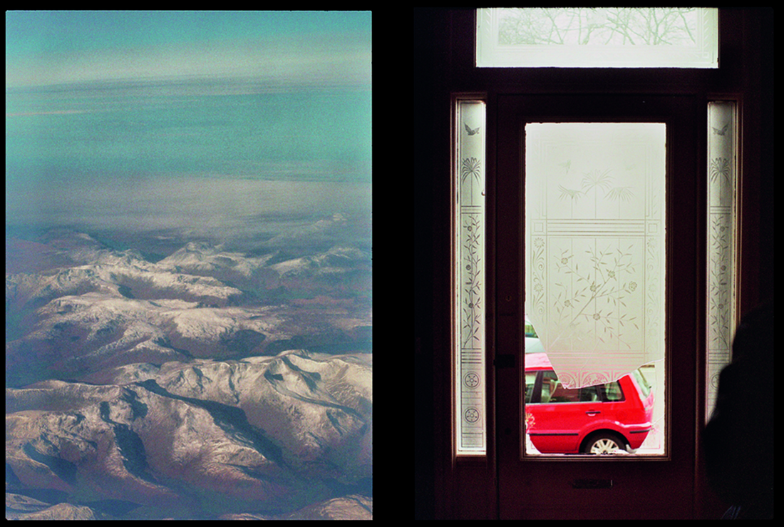
This might be one of my favourite diptychs made by Luke Fowler. I think the way the photographs are exact opposites of each other makes them work together well because it requires the viewer to think and make connections. For example, they are each taken from a different perspective- external and internal view. Or I like the way the mountains create a pattern of swerve lines and if you look closely at the other image, the top part of the window have branch like lines that remind me of the mountine shape. Both images are affected by daylight so they portray a sense of brightness. However, they contrast each other in terms of what is actually being photographed. The mountains are a natural cause, but the
|
|
car and the house are both manmade. Also, the first picture might look a little older because it is slightly grainy and the colours are slightly faded, however on the other side there is a clear contrast that involves bright and bold colours like red and green tones. I think that the second photograph has more negative space and it gives it more depth because of the contrast between dark and light, but the first image looks flat and almost like a postcard even though the mountains shadows make it stand out.
THE LIST-MY RESPONSE
In this task we were given a list of words and we had to take a camera and photograph the things on the list in any way we like.
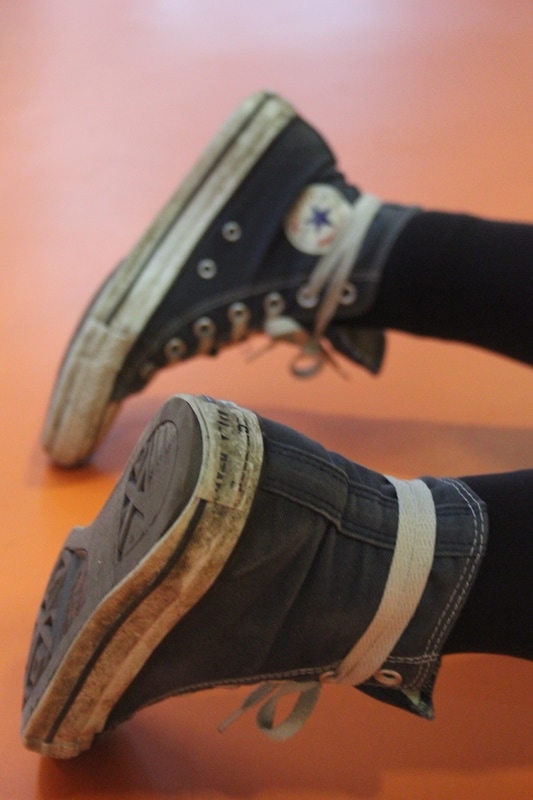
1. A strangers shoes
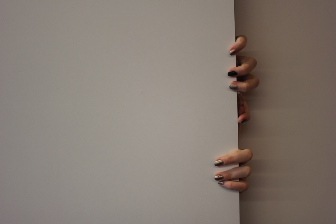
2. Hands
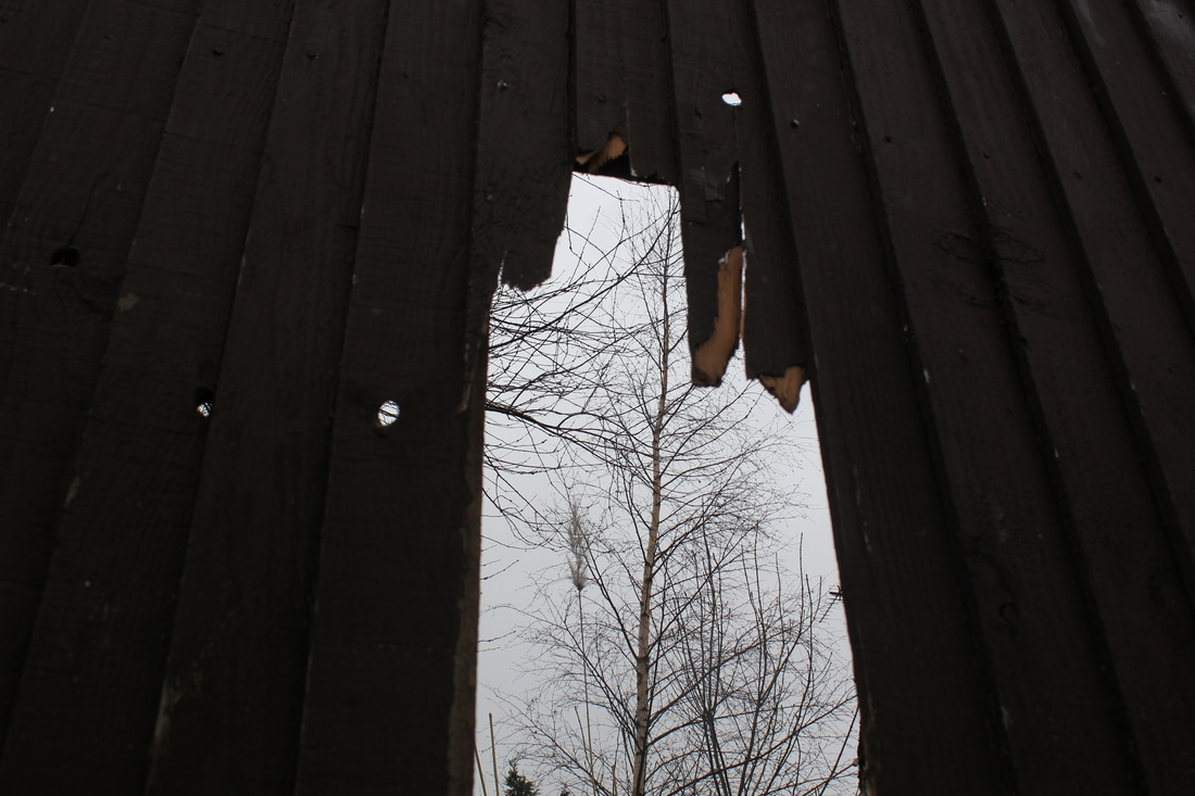
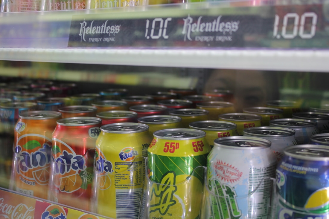
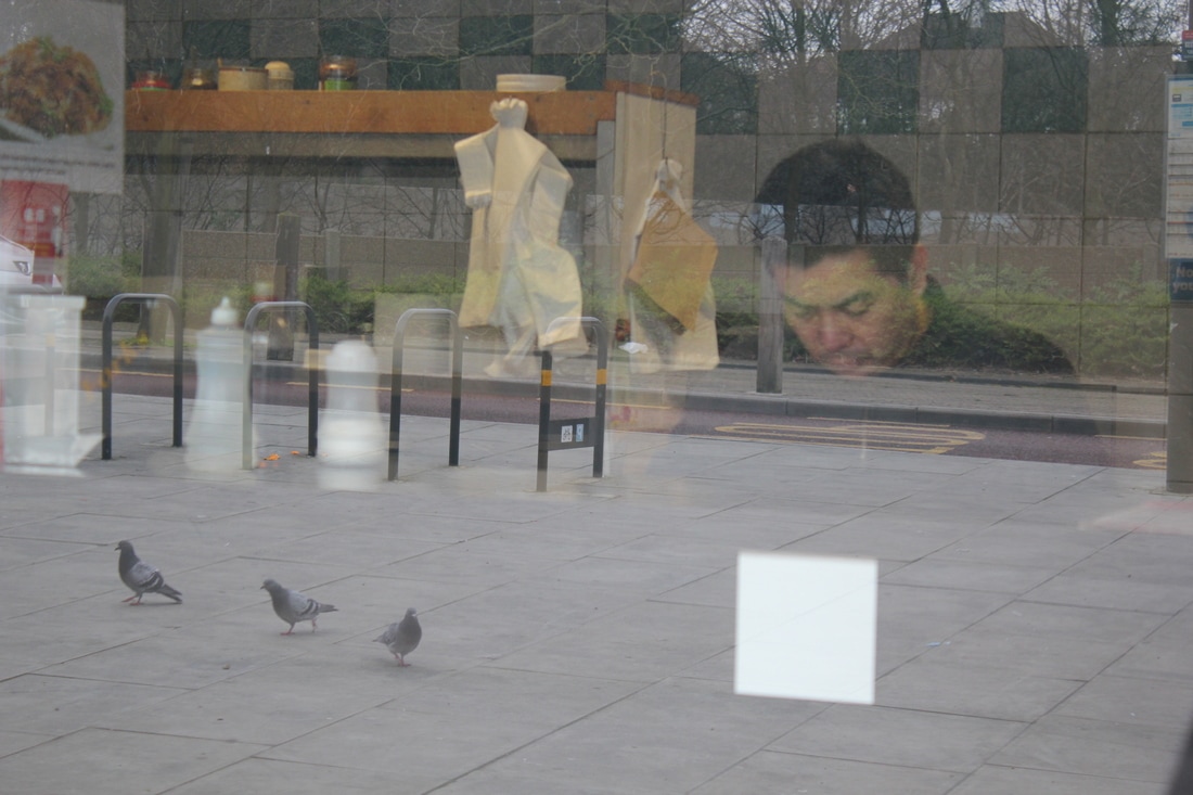
3. Reflections
4. The sound of silence
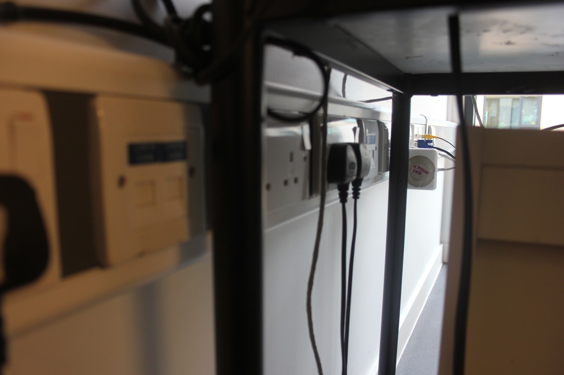
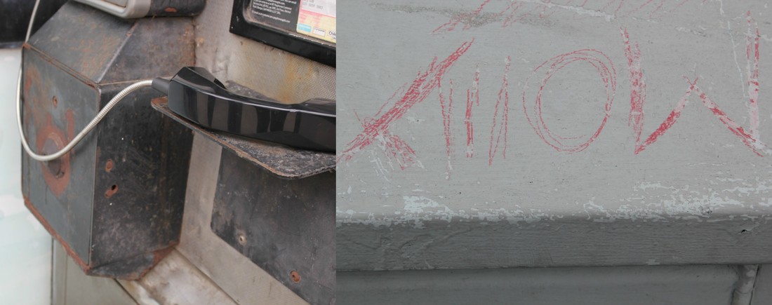
5. Electricity
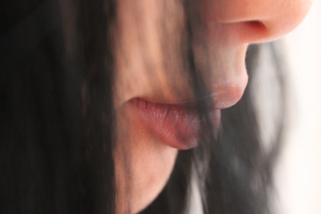
6. Lips
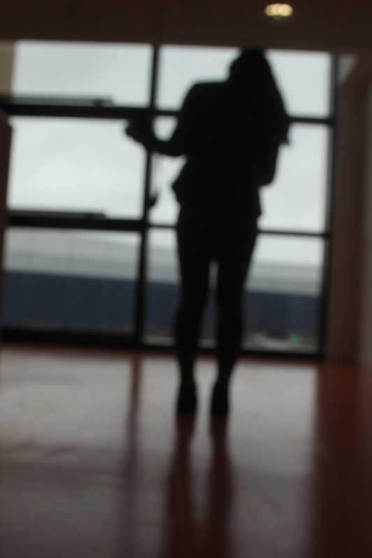
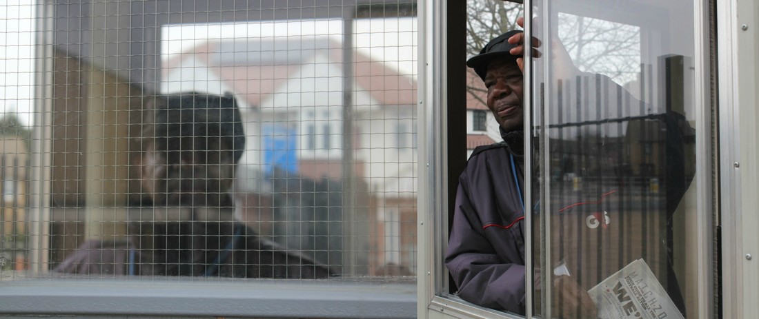
7. Silhouetted figures
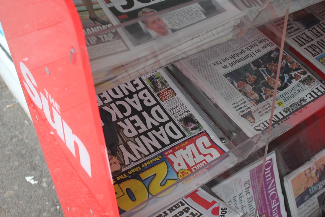
8. Artificial colour
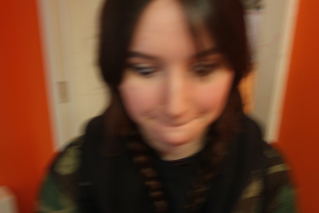
9. A blurry portrait
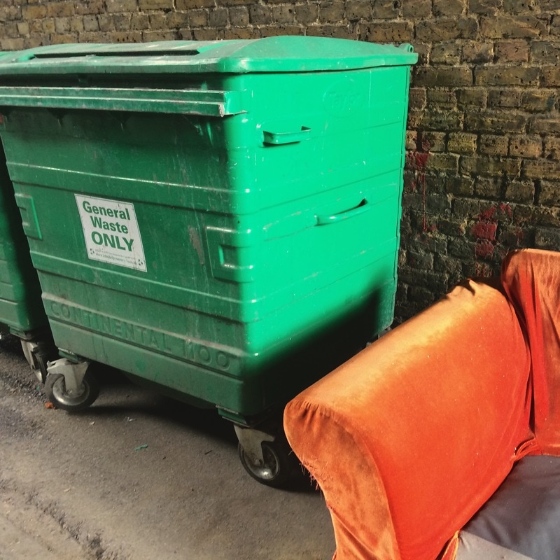
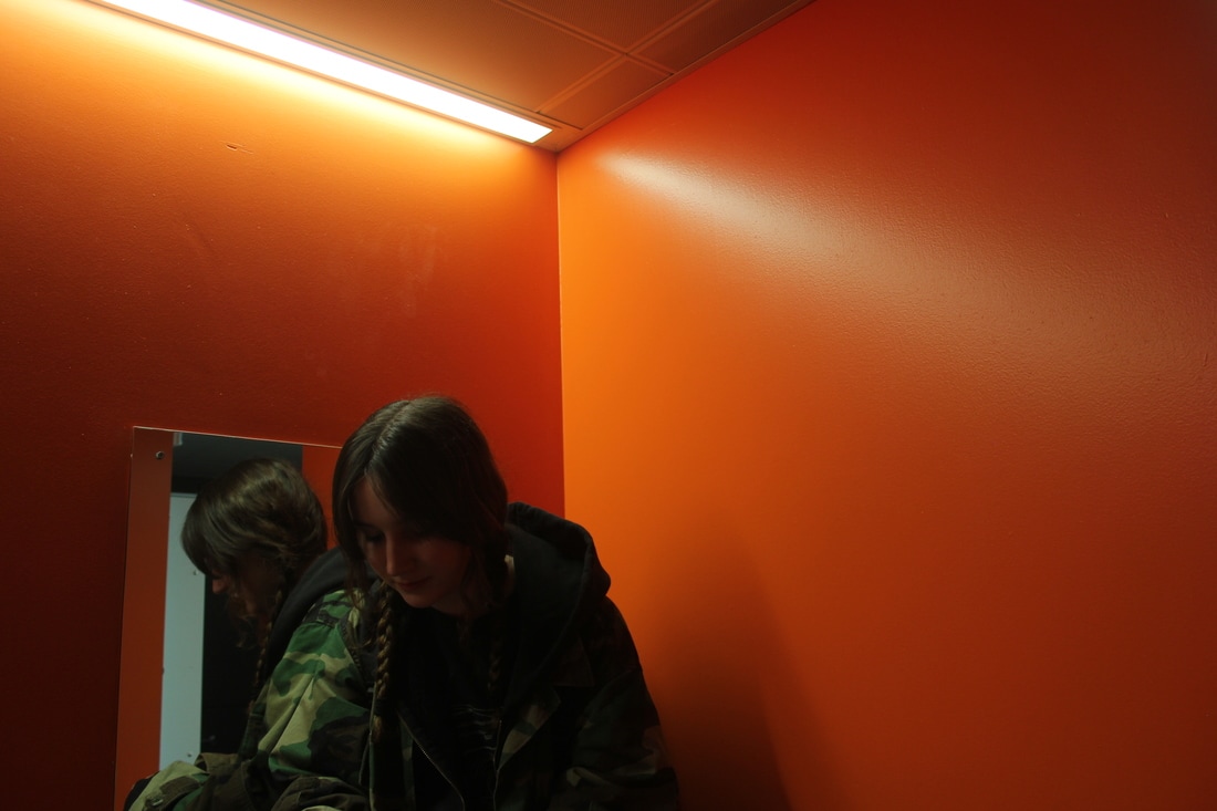
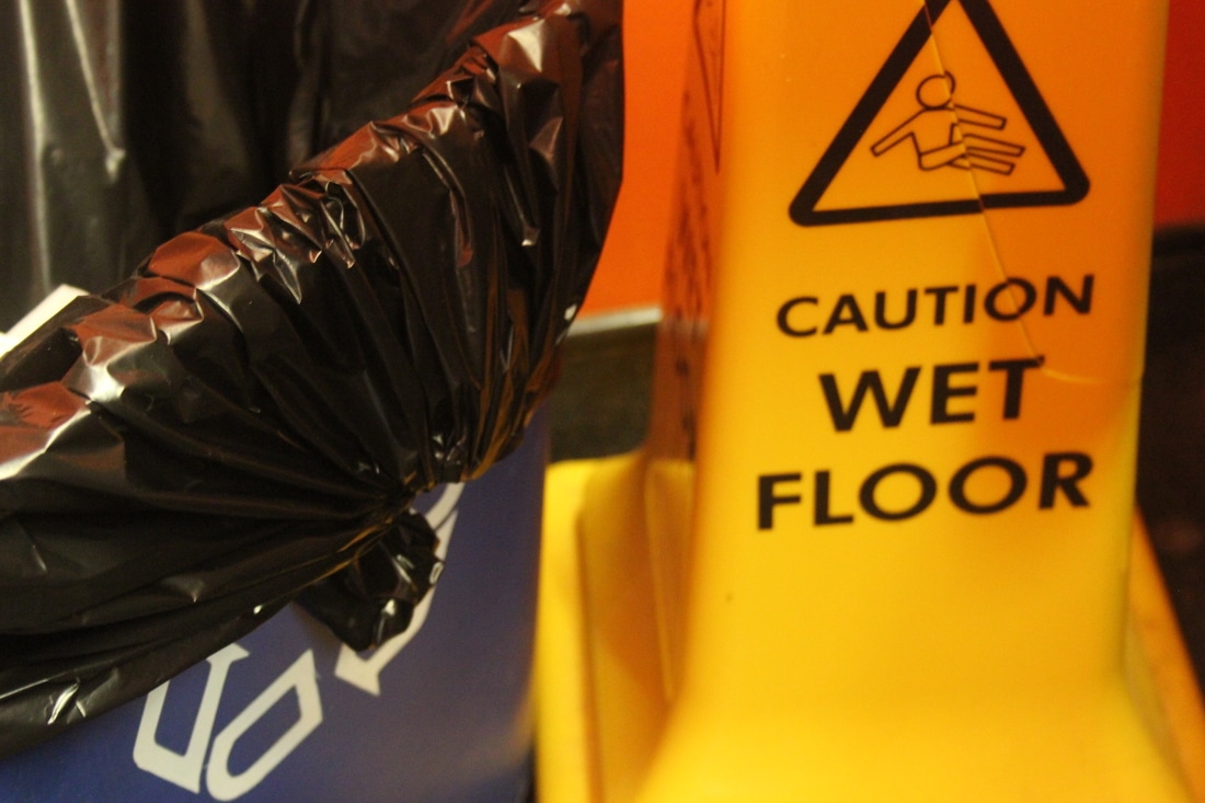
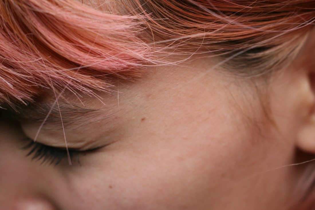
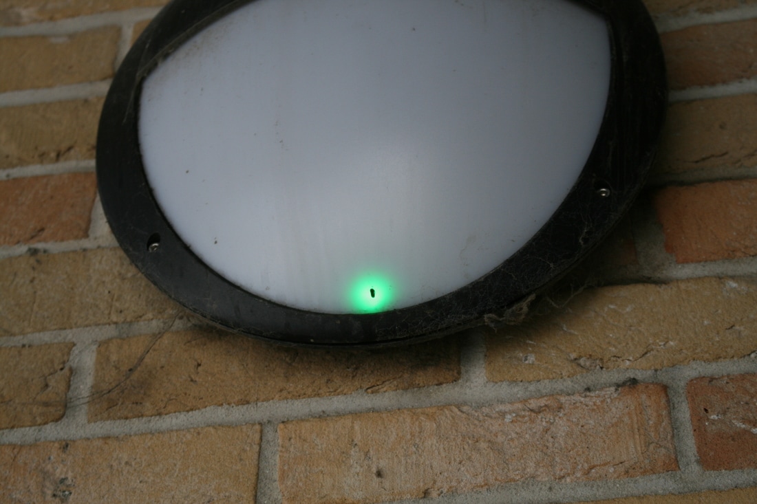
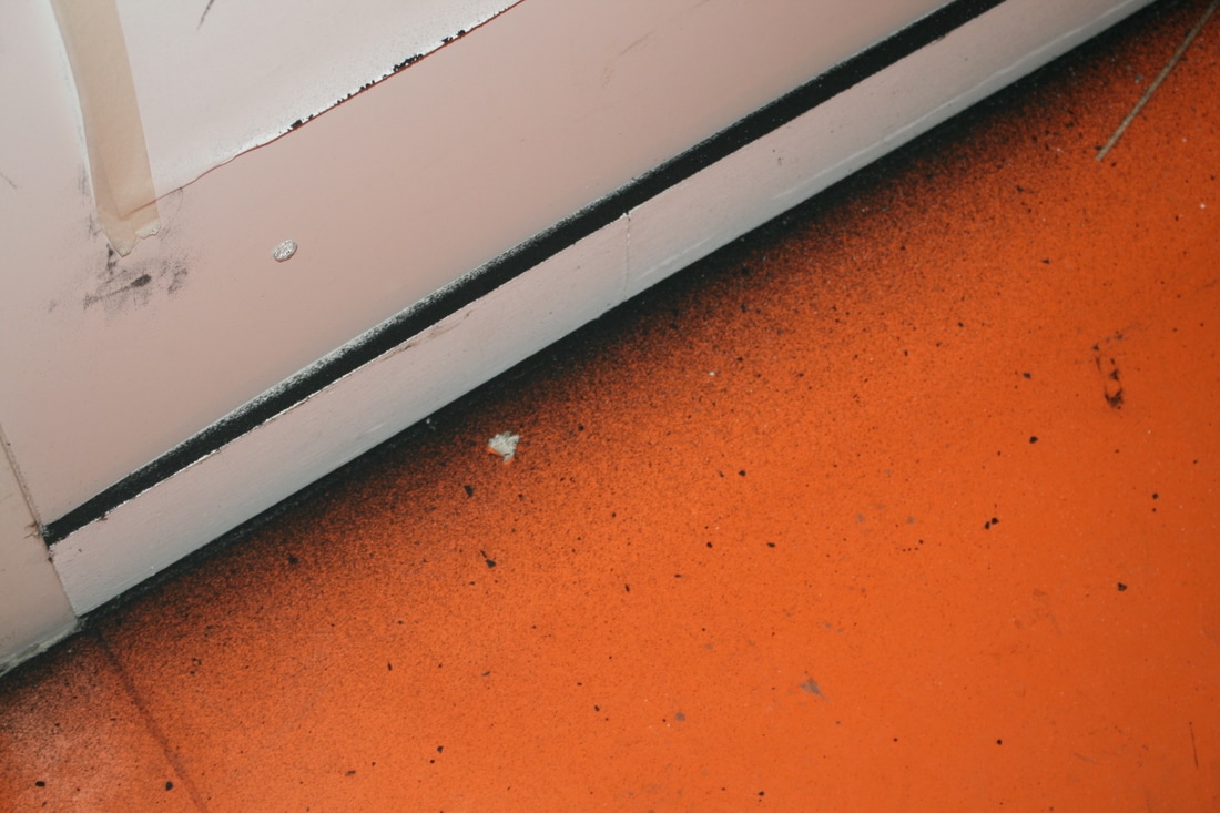
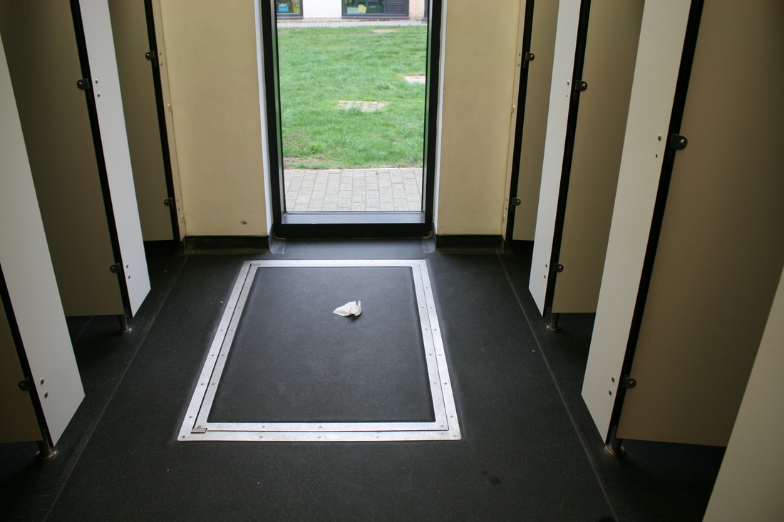
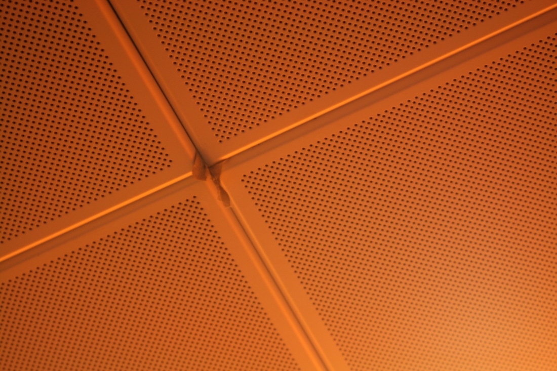
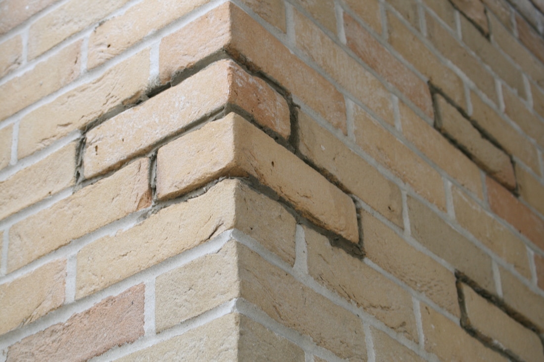
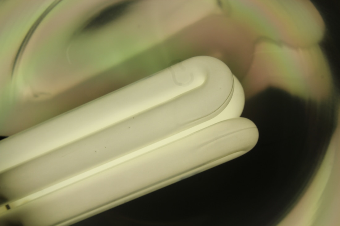
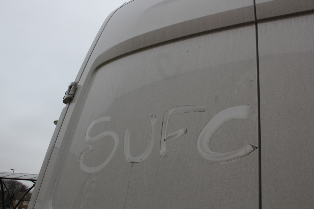
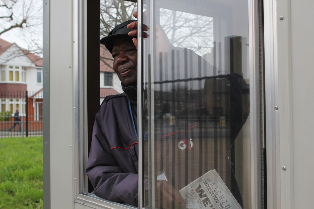
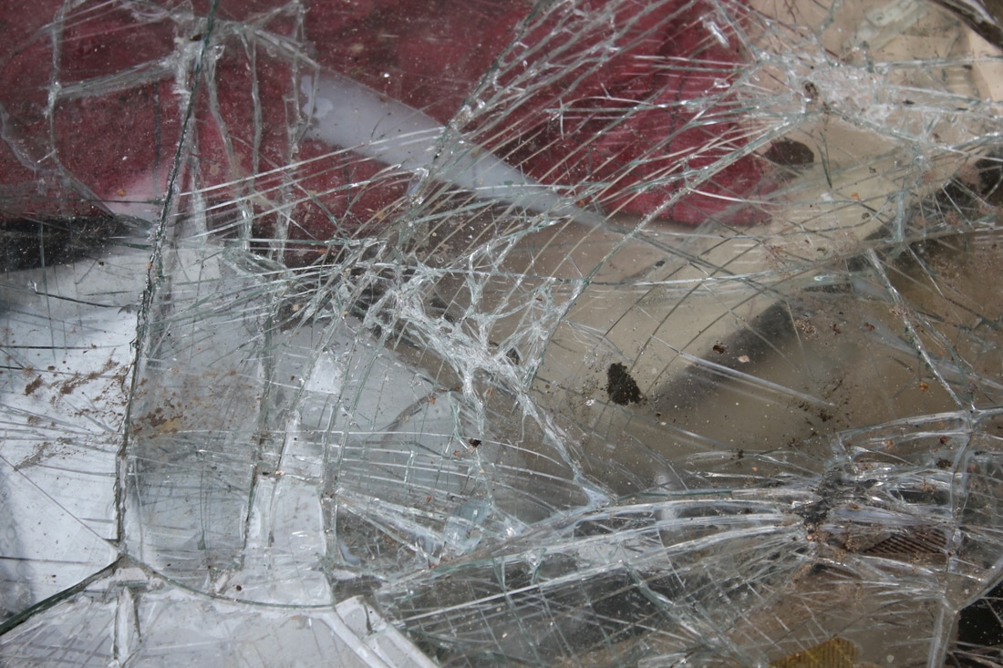
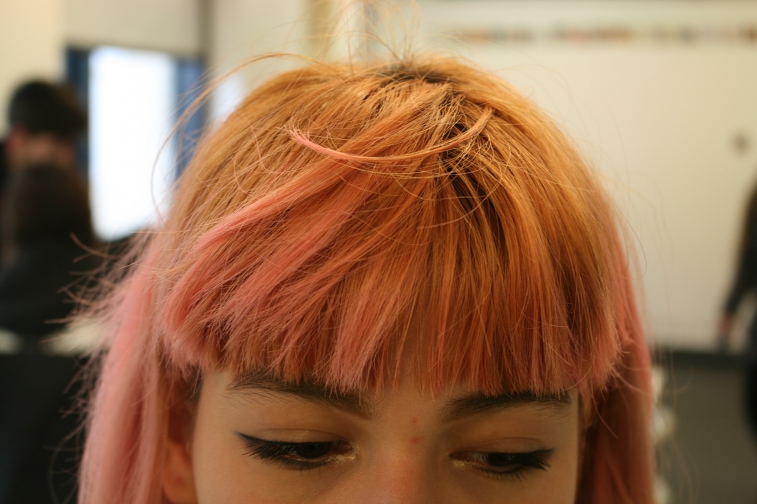
I think the idea and aim of this project was for us to get an instruction and make something out of it by responding in a unique way that makes us think outside the box. For example, it says to take a photograph of lips, but you might choose a specific view or perspective to photograph it from. I like how the photographs look together because they all share a similar orange tone. The task was limiting because we had an hour to complete it, so I decided to not waste time and I stayed in one building. This was also a challenge because I've been in this orange building so many times and I've taken a lot of pictures in it, but this time it really opened my eyes and I found new things and new ways of how to photograph the space. The task was pretty straightforward because I literally had to take photos of what it told me to, but I particularly liked the instruction of taking a picture of the sound of silence because I had to think about what it would be because I could look it at it from so many different angles as it's a broad subject and you can argue that a lot of things are 'the sound of silence', not only because everyone might have their personal take on what they find silent, but also because a photograph itself is still and silent.
1. A strangers shoes
2. Hands
3. Reflections
4. The sound of silence
5. Electricity
6. Lips
7. Silhouetted figures
8. Artificial colour
9. A blurry portrait
I think the idea and aim of this project was for us to get an instruction and make something out of it by responding in a unique way that makes us think outside the box. For example, it says to take a photograph of lips, but you might choose a specific view or perspective to photograph it from. I like how the photographs look together because they all share a similar orange tone. The task was limiting because we had an hour to complete it, so I decided to not waste time and I stayed in one building. This was also a challenge because I've been in this orange building so many times and I've taken a lot of pictures in it, but this time it really opened my eyes and I found new things and new ways of how to photograph the space. The task was pretty straightforward because I literally had to take photos of what it told me to, but I particularly liked the instruction of taking a picture of the sound of silence because I had to think about what it would be because I could look it at it from so many different angles as it's a broad subject and you can argue that a lot of things are 'the sound of silence', not only because everyone might have their personal take on what they find silent, but also because a photograph itself is still and silent.
LITTLE THINGS I NOTICE
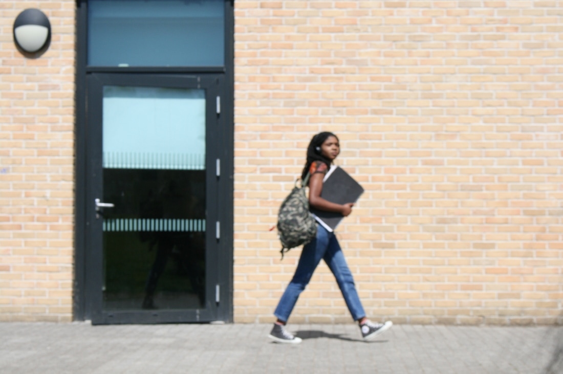
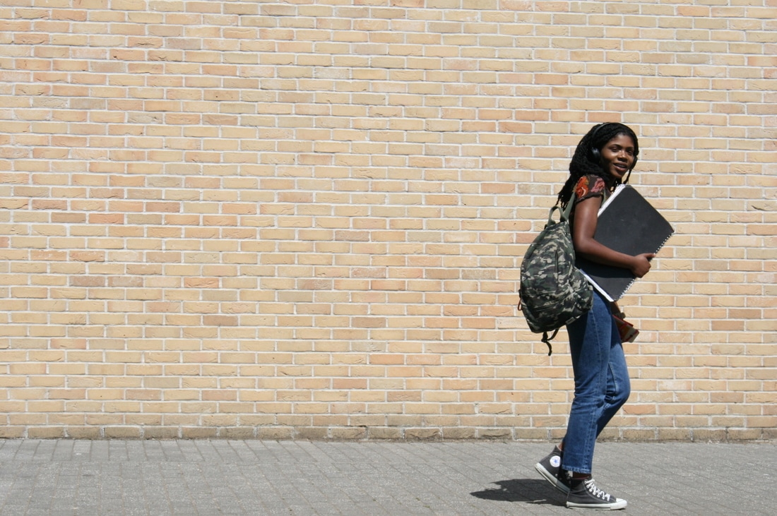
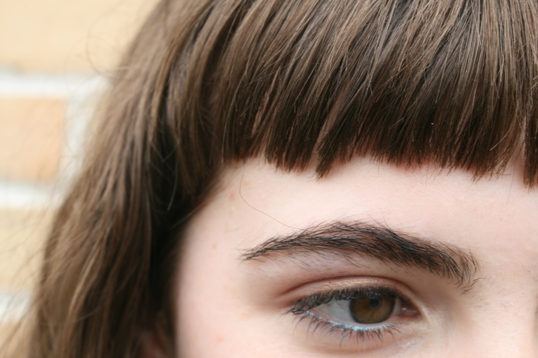
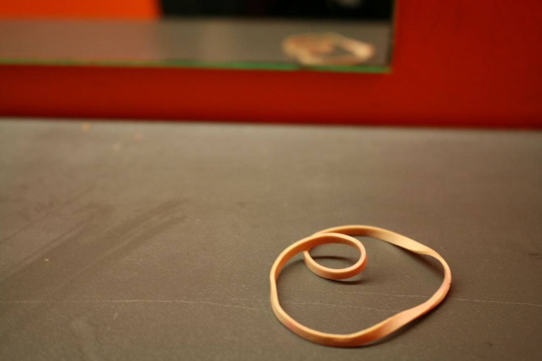
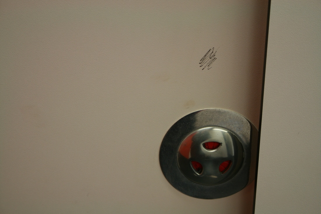
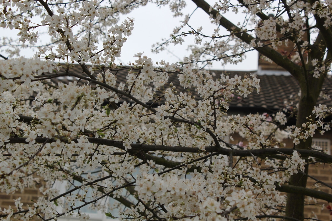
At the beginning of the lesson, we were told to write down 20 things we have noticed throughout the day. There was some obvious things on my list like the weather was nice, but after writing a few, I started remembering the small things like a strand of hair out a girls pony tail. From this list, our task was to go out and take as many photographs of the prior observations we made, but I found this difficult because everything I saw or remembered wasn't accessible, so instead I went around my school and started looking out for more things. Similarly to the task before, this made me look out for smaller details that I wouldn't have probably noticed and thought about before. Most of the observations I made throughout the day weren't available for me to photograph, so I set myself a task to photograph little things I noticed on school ground. Anything I would see and think looked interesting, I captured. Like my friends two birth marks on her temple, or an elastic band left on a surface on the schools toilets. We had half an hour to complete this task, so I found that challenging and I felt like with more time I would've made better photographs of more interesting observations I would've made.
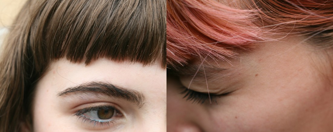
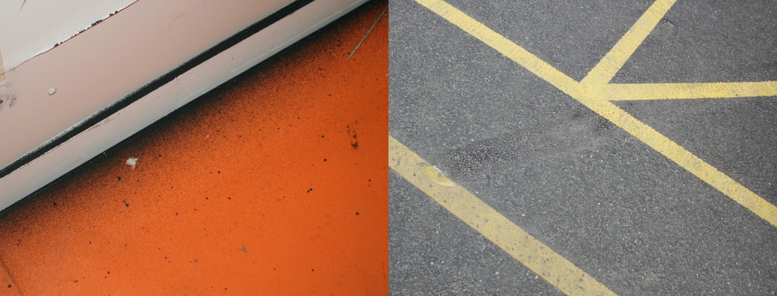
TRYING OUT SOME DIPTYCHS
THE ART OF INSTRUCTION
DO IT! It is the longest art exhibition running because people add new instructions and add in new ideas for the new generations that will create new art and sculptures. The fun thing about the art of instruction is that you can read the instructions and you don't need to literally interpret it because some of the messages might be poetic and metaphorical so it is your choice of how you respond to it. The art of instruction is about creating new instructions for the new generation which will spark new ideas, new sculptures and new art. It is questioning the definition of art and what it is. In some perspectives, it is known as anti-art because goes against everything "normal". It all started with Marcel Duchamp and him making pointless, simple sculptures that don't really look amazing or don't relate to traditional art. Hans, Ulrich and Obrist had an idea of creating a series of instructions that will be followed and later on, developed. One exhibition sparks another and that's how they spread. The exhibition will never end because something new is being created every time.
|
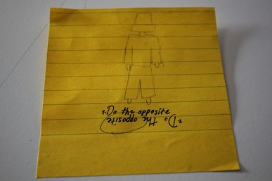
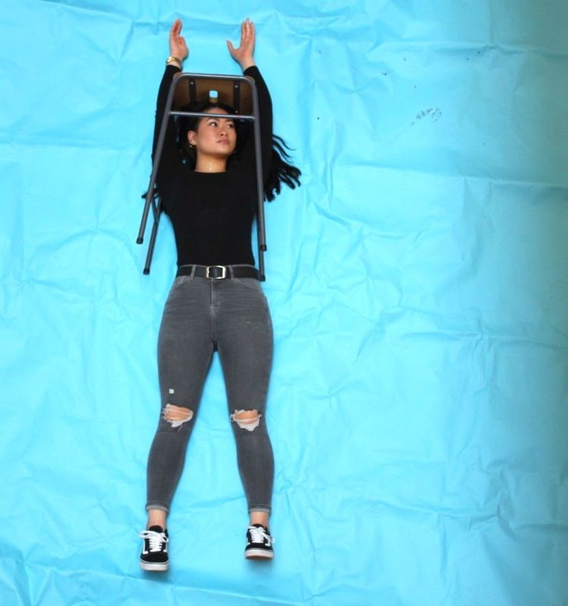
Our task was to write an instruction in pairs and give it to the teacher so she could mix them up and them back to us, so now we would have someone else's instruction. Here on the left, is an instruction that I received by someone in my class. It says do the opposite and there is a sketch of a person with a bucket on it's head. I liked this instruction because the wording of it wasn't long and complicated. It was quite short and didn't have much to it and this is where the fun part came in- we got the opportunity to invent an action or sculpture of anything that we think is doing the opposite. I was paired with Amy and at first, when we read our instruction, we didn't know what to do and we were sitting and planning what to do. It took us a while to come up with something so we decided to walk through the school and get inspired.
|
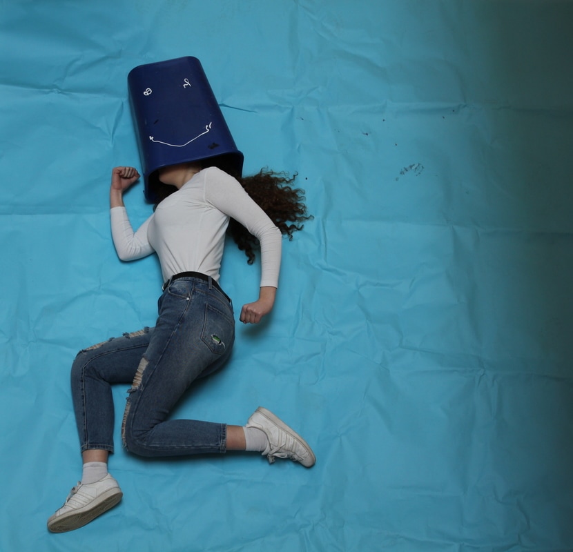
We saw a big blue scrunched up paper and decided to use it in a way where we would lie on it and take pictures from above so it looks like it is a backdrop and we are standing, not lying.
ERWIN WURM
|
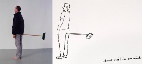
Erwin Warm is one of the famous artists that responds to the art of instruction. During an exclusive out of hours viewing of Performing for the Camera featured artist Erwin Wurm invites you to make a One Minute Sculpture. Through his work Erwin Wurm questions and reflects on sculpture itself, seeking to overcome its restrictions, limiting its life time to one minute only. Using everyday domestic objects and found furniture, Erwin creates situations and instructions that allow you to become an artwork for sixty seconds.
|
MAKING A PHOTOBOOK
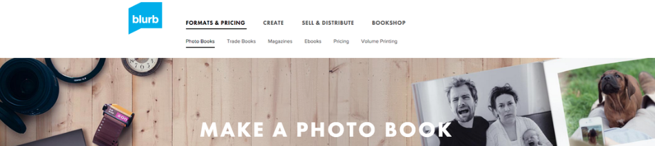
BLURB- this is a website where you can design your own photobook online and send it to be printed off to create a physical book. You have the choice of every detail and the look of the final outcome is absolutely up to you. It goes from choosing the covers, page numbers and layout. This is a great way to create a photobook because it looks neat, clean and professional, but it is also made fairly quickly with a reasonable price. The process and decision making of the final photo book shouldn't be rushed and it should be well thought through since you are paying £30 for the hard cover photo book. These kind of photo books pay off because it will last for a long time, so you will always be able to keep it and cherish it, but also, it looks neat and easy to look at.
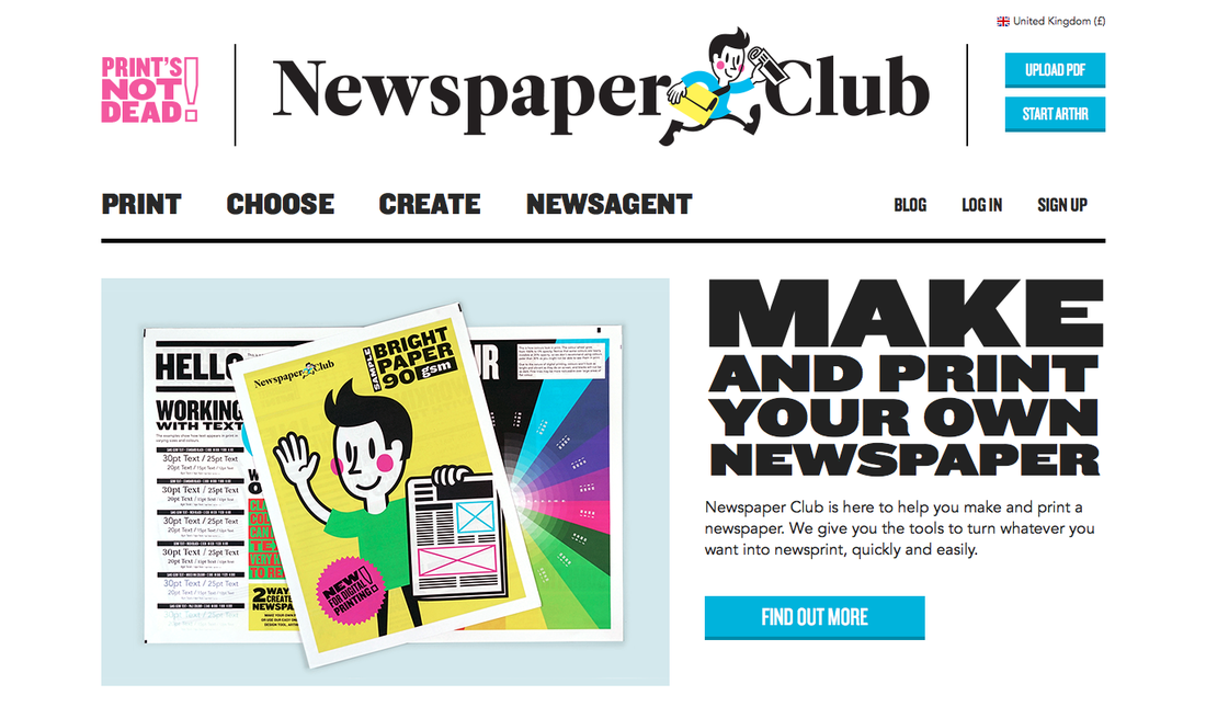
NEWSPAPER CLUB- this is a popular website where you can make your own magazine or fanzine. If you don't want to present your photos is a hard cover photo book, there is the option of making a zine where your photographs will get a different feel and
|
physical look. This is a cheaper option of presenting your photographs and it changes the way you want to show your images. You could include 6 images on a double page because the sheets are large and you might want to group your images and present them in that way. However, if you have a certain theme, choosing to include your images in a zine might relate and make sense as long as it has a explanation behind it. Personally, I prefer a hard cover book because it has a different feel to it, but with a magazine you can print a few copies for the price of one photo book, so you can share them out and more people would be able to view what you have made.I like that we can choose the physical state of the final photo book.
|
|
|
|
What I like about this project is that there in no fixed instruction on how to do our photobook. If you are feeling creative, you have the option of making your own photo book from scratch. I feel like having your own hand made photo book bring a lot of character into the final outcome and it might relate to the photographs and the images might have impacted the decision making of the physical photobook. |
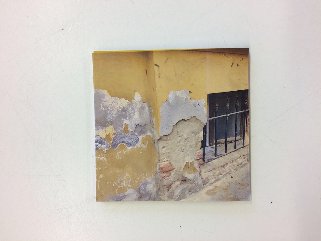
MOQUETTE
|
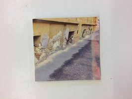
I didn't think I would like this cover for a photo book, whereby there is no text and only one image on the back and front. It is one image, so if you open the photobook and look at the covers (front and back) side by side, it will join and look like one single image. The reason i picked this image for my covers is because it is a road and it leads to something but you can't quite see what it is.
|
|
|
By creating this, I feel like the viewer will want to know what goes on and what happens next. The cover is so important when it comes to the photobook because it is the first thing the viewer will see and it has to spark their interest. The other reason why I decided to choose this image is because I personally like it. It is similar in terms of colour if you compare it to all the other photographs in my moquette.
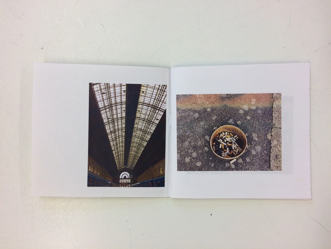
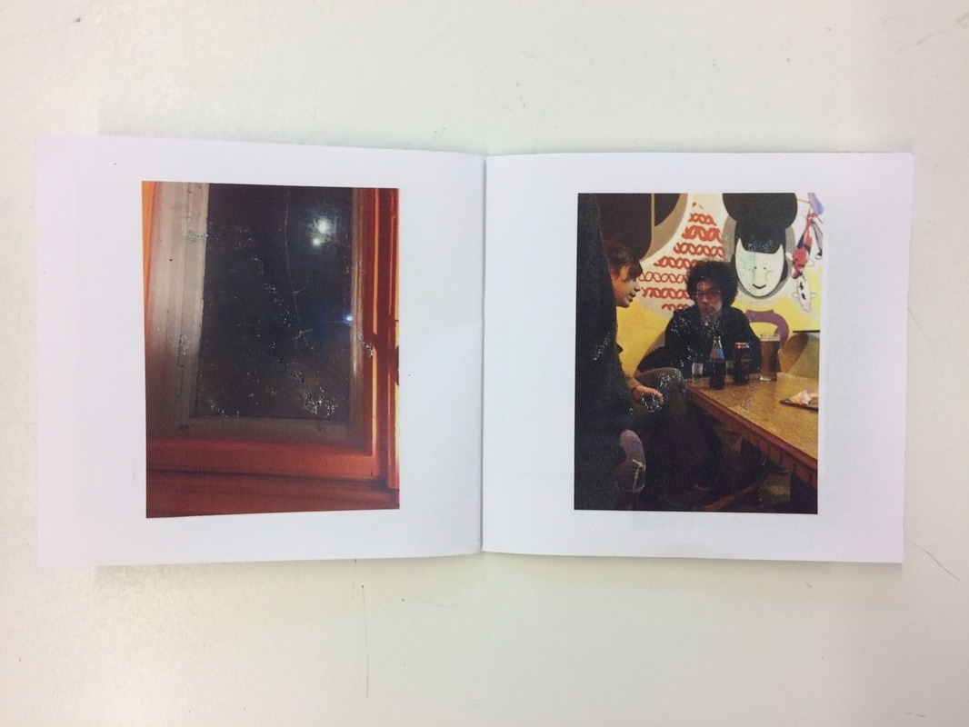
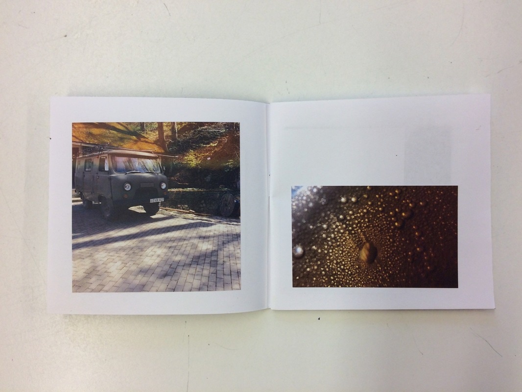
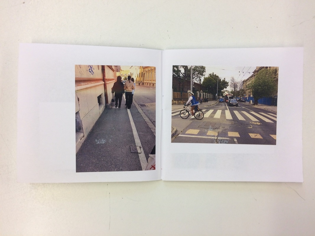
I like how my first photobook came out. There is not much I would change, however, I would maybe like to experiment more with the layout. I like the layout as it is, but I want to do something different and not so simple. I would maybe play around with the idea of layering the photographs on top of each other. Minor mistakes aren't that serious because the book was handmade and it's almost impossible to get it perfect, but I am getting my actual photobook done professionally so the photographs are going to be perfectly layed out on the pages.
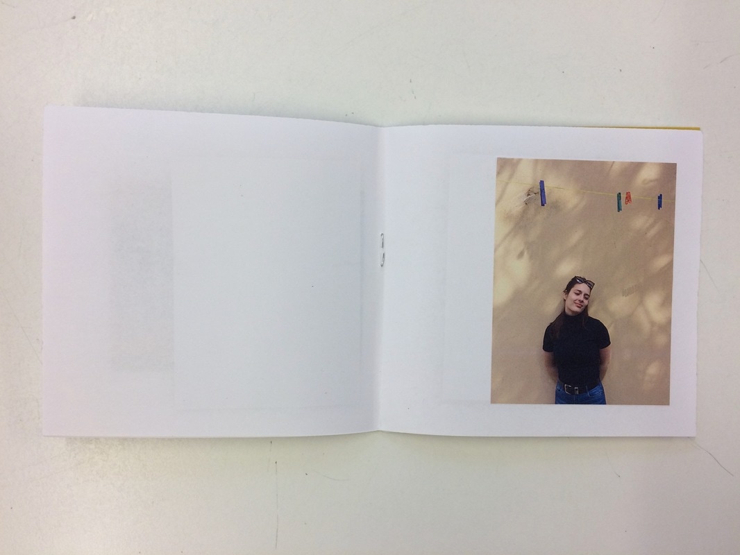
When collectively looking at all of my pages together, I feel like i chose the right 20 images from the 100 pictures I took. I edited some of them and played around with the brightness and contrast beforeI printed the images of. The printer I was using was running out of yellow ink, and due to that, there was a pinkish kind of line covering the photograph on my cover page. I'm calling this a happy accident and I will look into how I can actually make photographs like that in photoshop because it looks nice and add an extra something to the front cover.
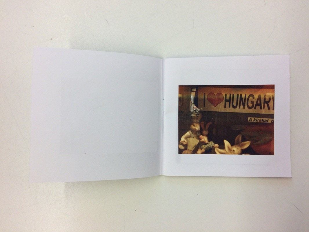
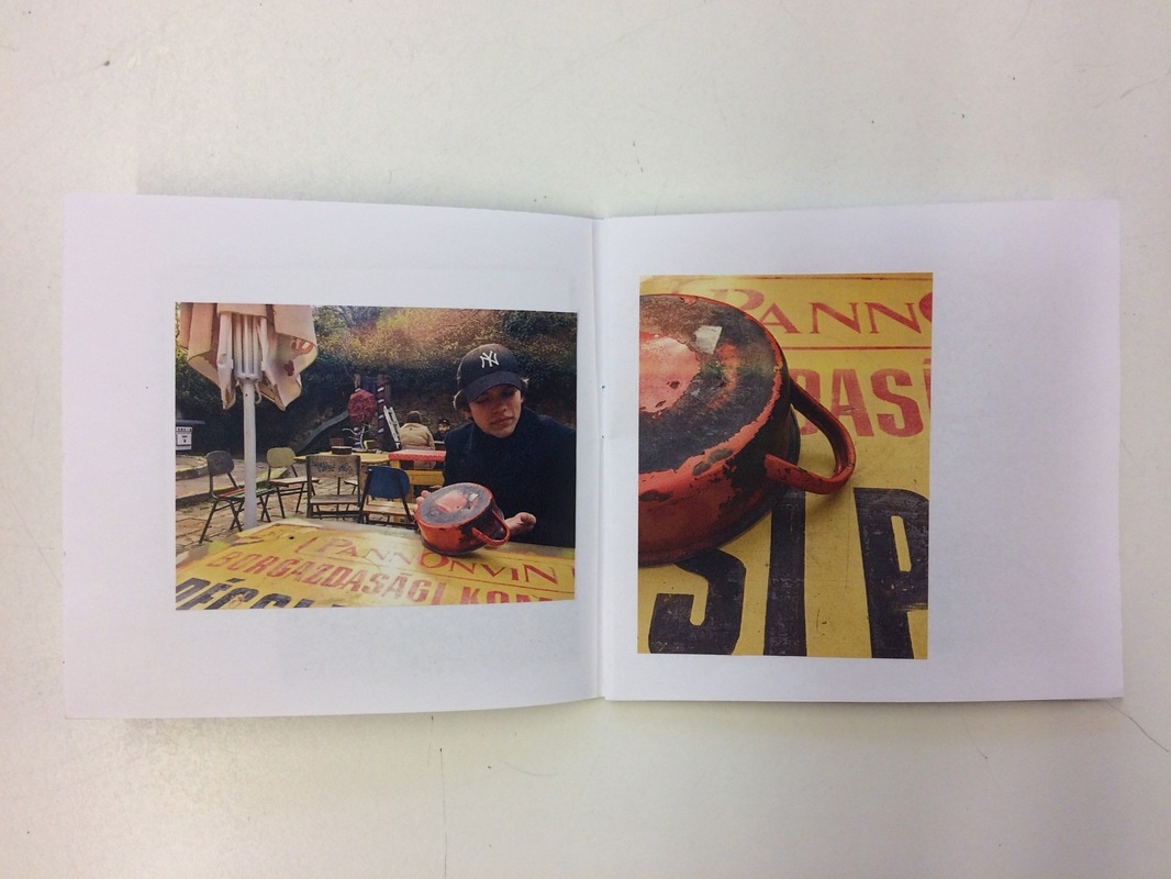
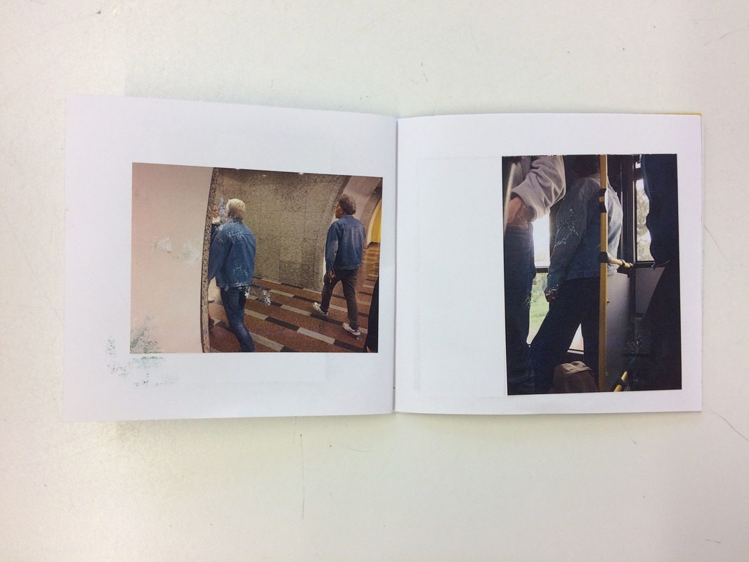
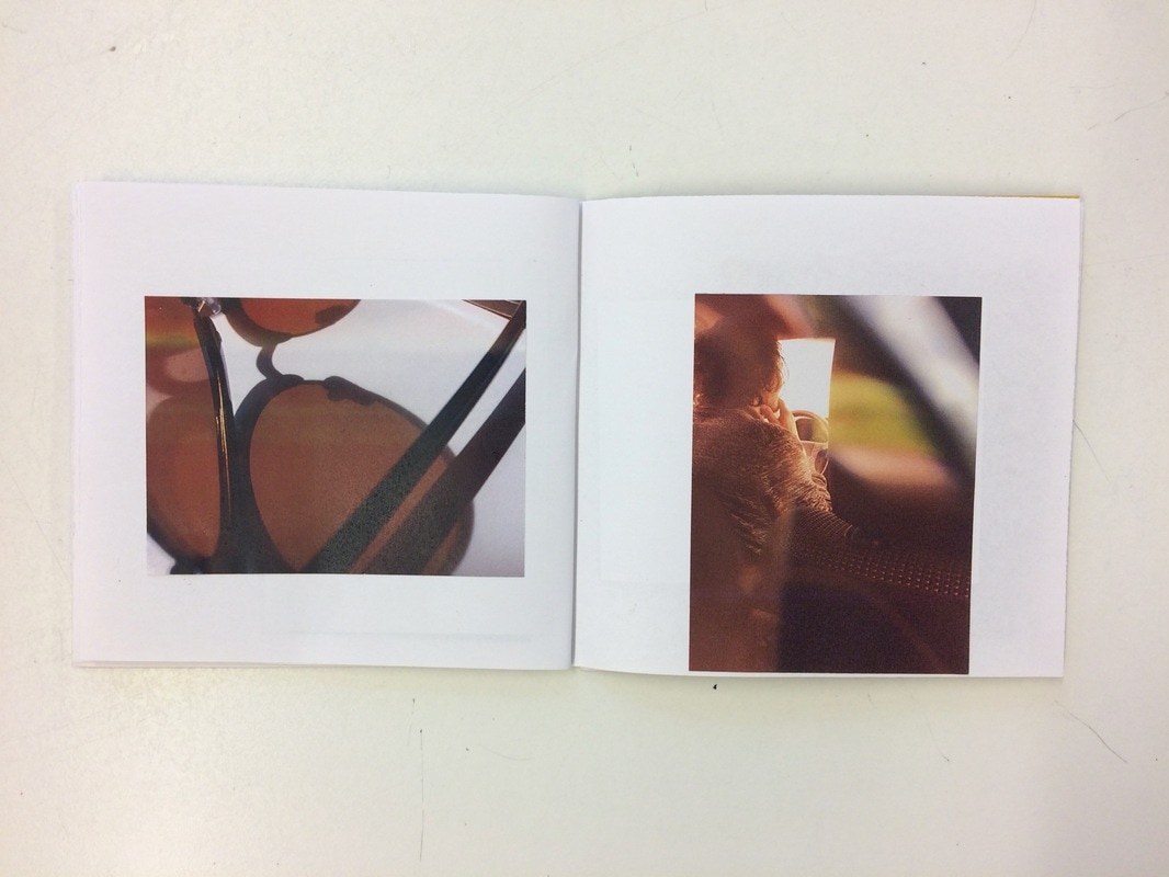
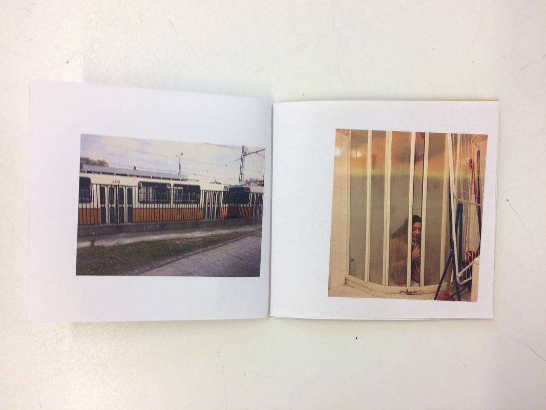
I carefully thought of which images will work well together on two pages and I chose the ones that really compliment each other. I was looking at lines and similarities between them (girl in shower and old train) and in others, I was looking at colour (close up of sunglasses and person driving a car). In the picture of the men in denim jackets, there is a picture right next to it with one of those men on the same bus that I was on. The first image was taken in the morning, and the second in the afternoon so I thought they would work well together and plus, they have a nice background story to it
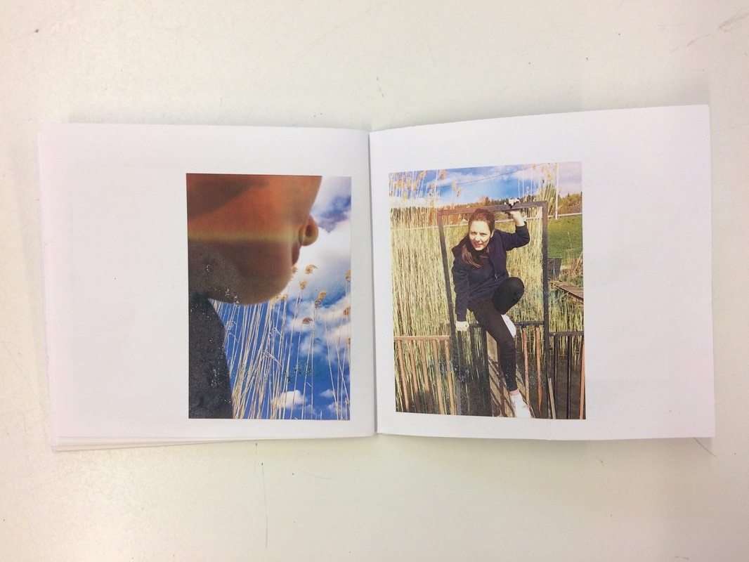
While flicking through my photo book, I realised there is a story I am telling.
When collectively looking at all of my pages together, I feel like i chose the right 20 images from the 100 pictures I took. I edited some of them and played around with the brightness and contrast beforeI printed the images of. The printer I was using was running out of yellow ink, and due to that, there was a pinkish kind of line covering the photograph on my cover page. I'm calling this a happy accident and I will look into how I can actually make photographs like that in photoshop because it looks nice and add an extra something to the front cover.
I carefully thought of which images will work well together on two pages and I chose the ones that really compliment each other. I was looking at lines and similarities between them (girl in shower and old train) and in others, I was looking at colour (close up of sunglasses and person driving a car). In the picture of the men in denim jackets, there is a picture right next to it with one of those men on the same bus that I was on. The first image was taken in the morning, and the second in the afternoon so I thought they would work well together and plus, they have a nice background story to it
While flicking through my photo book, I realised there is a story I am telling.