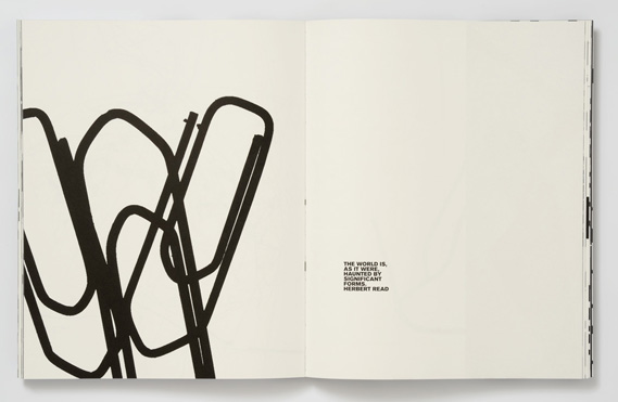
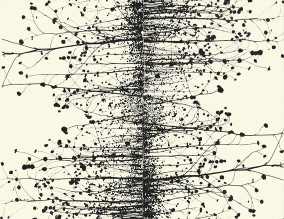
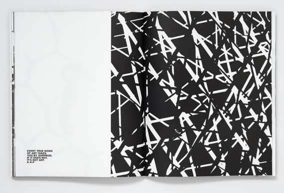
KELD HELMER PETERSEN
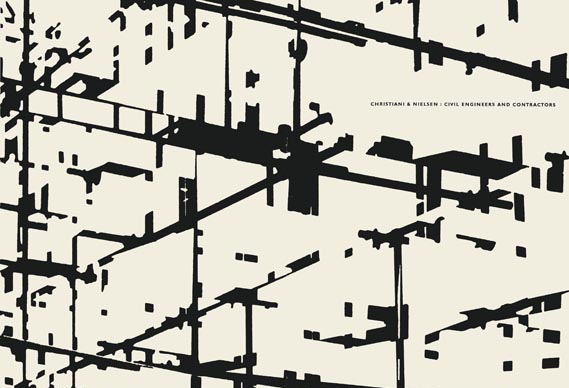
Keld Helmer is a danish photographer who is known for capturing industrial areas, cityscapes and nature. But what makes him exceptionally unique is that he edits his images to the point where you can only see abstract or geometrical black and white shapes. His work was inspired my Albert Renger Patzsch, because Keld liked the way Albert took black and white photographs in high contrast, but you can tell that Keld developed his own style of turning up the contrast to make the objects in the photograph unrecognisable. The images are so high in contrast that the objects in the photograph loose they're realistic look, but you can still clearly see the outline. I also like the layout in which he presents his photos because he doesn't overcrowd a double page in a book, but he smartly puts an interesting and busy photograph next to a simple and plain one, so they work nicely together.

EXPERIMENTING WITH SOME PHOTOS FROM 'THE WORLD IS BEAUTIFUL'
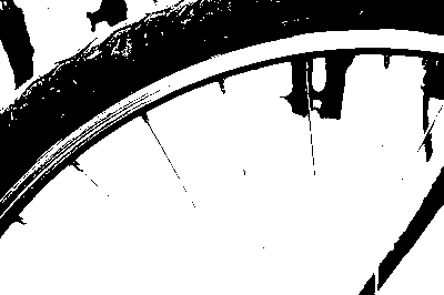
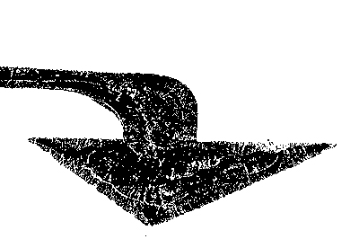
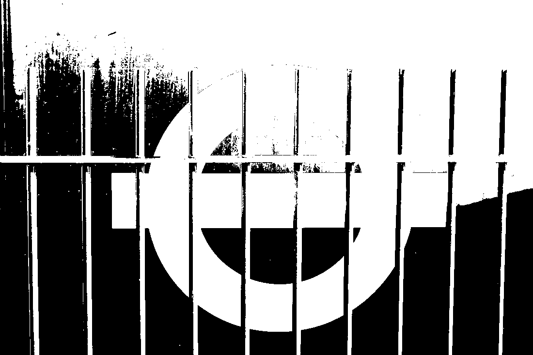

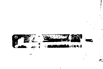
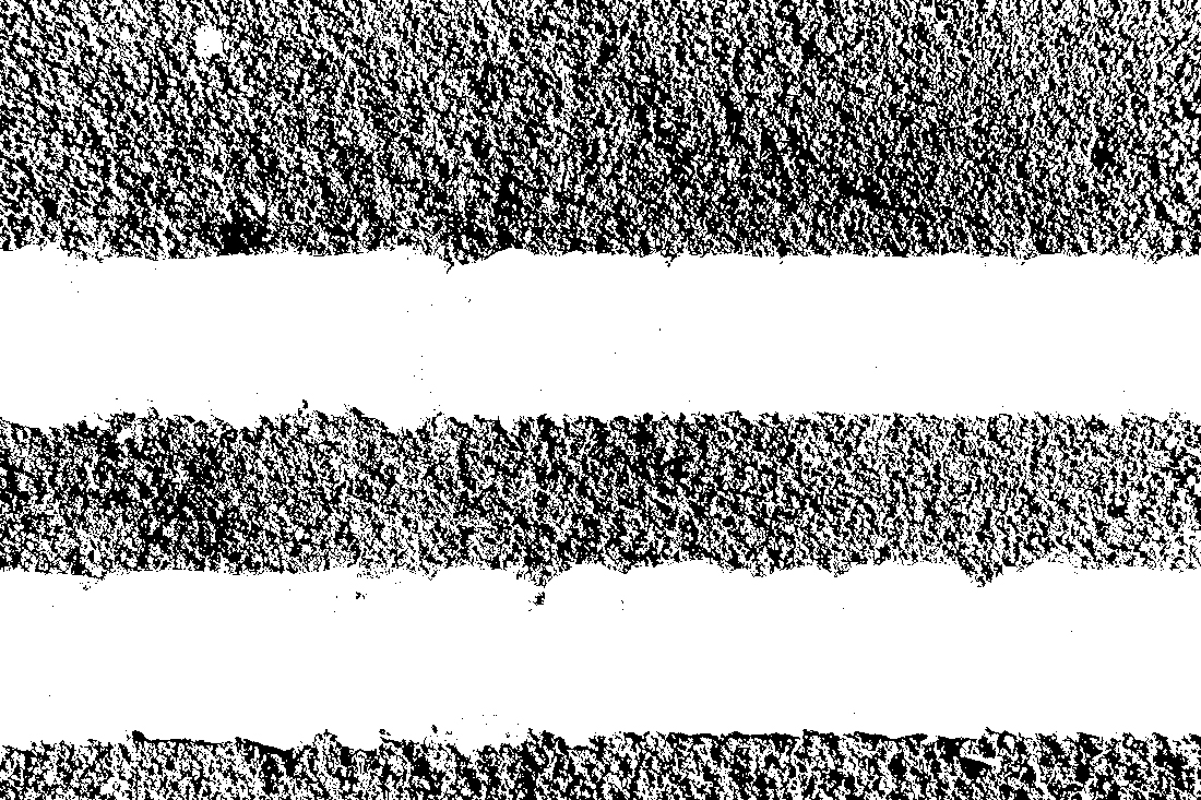
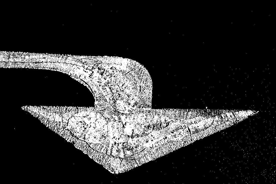
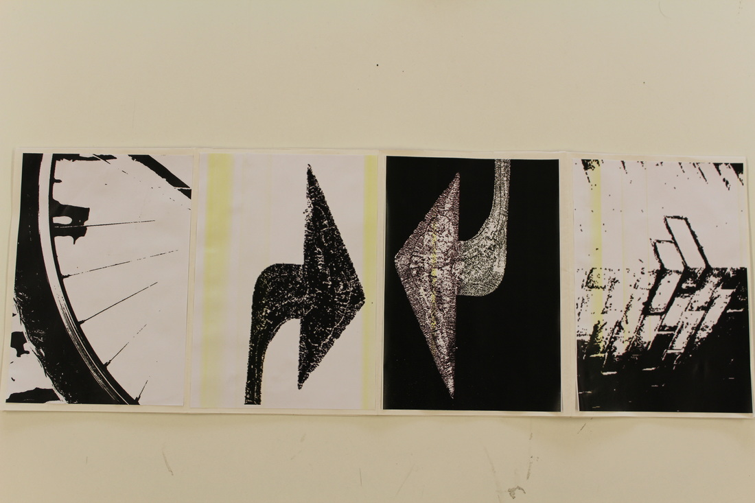
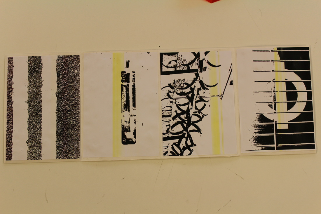
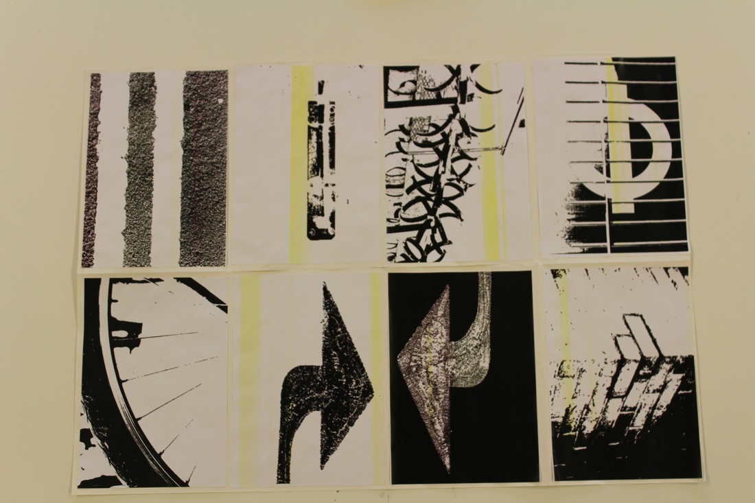
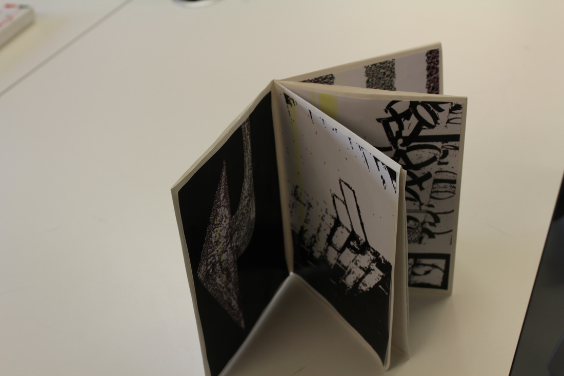
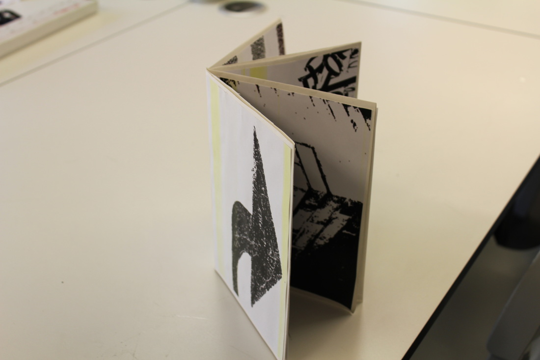
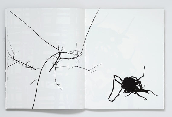
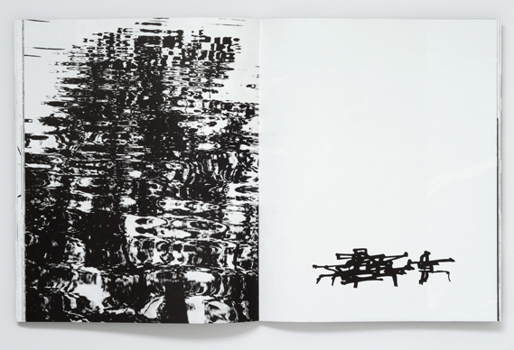
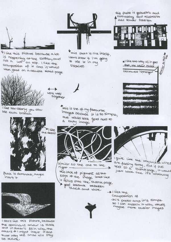
Some of the photographs came out very clear, full of detail, but some unfortunately, when printed, became pixelated and fuzzy. Most of the photos printed out and stuck into the booklet have yellow lines across them due to a technical difficulty with the printer, but when making my second set of images for a different booklet, i will make sure i am using a printer that is working properly and producing high quality images. I didn't want my booklet to be overcrowded so I layered out the photographs and tested out which ones complement each other and don't look too busy when put together. In my previous '100 photographs' I didn't have many simple photographs to work with, but for my second booklet I will make sure I have a range of both busy and simple images. I will think about the composition and what I am photographing before i capture some geometric close ups of different surfaces and textures. I also have to bare in mind that when the big sheet of paper folds into a booklet, the composition of the images will move so I have to make the booklet and then start placing my photographs on the pages. I was having difficulties making the images the same size as the pages of the booklet, but in my second booklet, I will cut the remaining parts of the page, so the image fulfils the whole surface of the page.
RESEARCH AARON SISKIND HARRY CALLAHAN
EVALUATION OF NEW PHOTOS
|
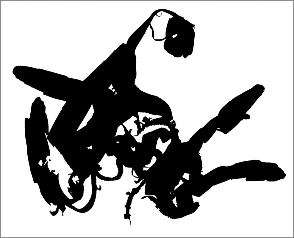
Since looking at my previous images, i though about composition and I was aiming to not overcrowd my pages of the booklet. On some of the images, I thought there is too much black dominating the photograph and it wouldn't blend in and look nice together. However, I like the photographs so to make them fit in to the rest of the gallery, I will invert the colours in photoshop and that way, they will look more smiple and work better with the rest. I like the way some images have a the whole object within the frames and those can look good when stuck in the centre pages of the concertine booklet because nothing needs to be connectet to the rest of the images. However, the busy images are limited and when put next to a blank page, it will look weird because they don't blend nicely with the rest. This limitation of the object in the photograph acts nicely if put on the side of the concertine booklet because the edges are already there and there is nothing it needs to blend into. I am thinking of taking more images that can work with the busy photographs, and that I can make two booklets that are completely different from each other but still have the same concept as Keld Helmer Peterson of using multiple images to create something bigger when combined. |
