Decisive moment is a moment that will only ever happen once, but as a photography style, a decisive moment is
when you are able to capture that moment on camera. A good way of achieving this is by going around and taking a
a lot of photographs until you find the one that you like. It is a new way of looking at the world all together.
when you are able to capture that moment on camera. A good way of achieving this is by going around and taking a
a lot of photographs until you find the one that you like. It is a new way of looking at the world all together.
HENRI CARTIER BRESSON
|
|
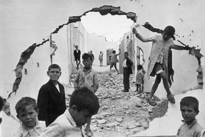
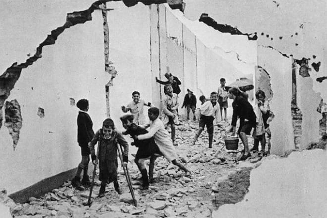
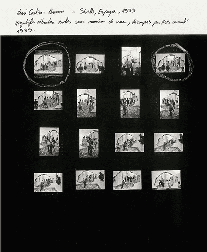
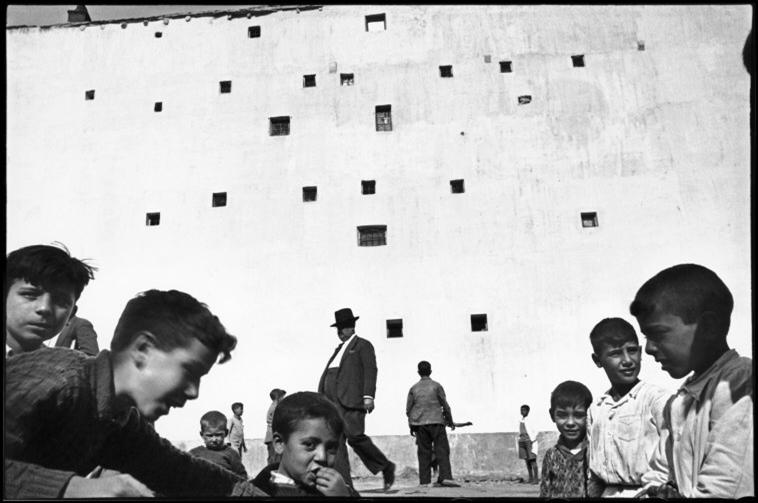
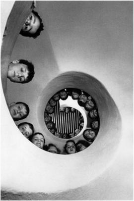
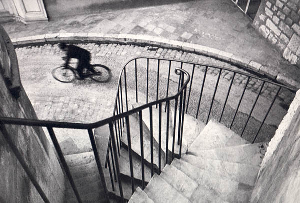
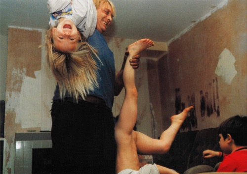
Henri Cartier Bresson invisioned his photographs before taking them but he took hundreds of photographs hoping he'd get one or two that are effective. Bresson personally liked the framing on the second potograph because it follows the rules more and is thought to be easier to the eye; uses the rule of thirds, load of geometric shapes (triangles between the legs and crutches). But I personally prefer the first photograph because it plays around with the rule of odds where the main objects in the image are of an odd number. All the children are standing still and there is pleasing look of vertical lines throughout the image. As well as seeing everything clearly in the front, you can see the back just as good and it gives the image more depth because you automatically get a sense of what is nearer and what is further. In the first photo, you could argue that Bresson knew the rules (evident on the second photograph) and was able to brake them by making the children step out of the hole in the wall and mess about with the composition where everything important isn't in the centre. These two images fit in a sequence with many other and you can see that because in the second photograph, the children haven't noticed that they are being photographed and you can see them having fun even thhrough the war and i think this is also one of the main reasons Bresson might have liked this image the most. But first image was portrayed more in the media because it looks very emotional because children should be having fun but instead, none of them are smiling and it will have a bigger impact on the audience that see this photograph.
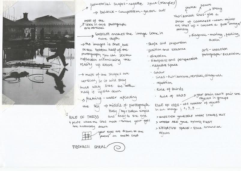
PHOTOGRAPHY IS AN ART OF SELECTION RATHER THAN INVENTION
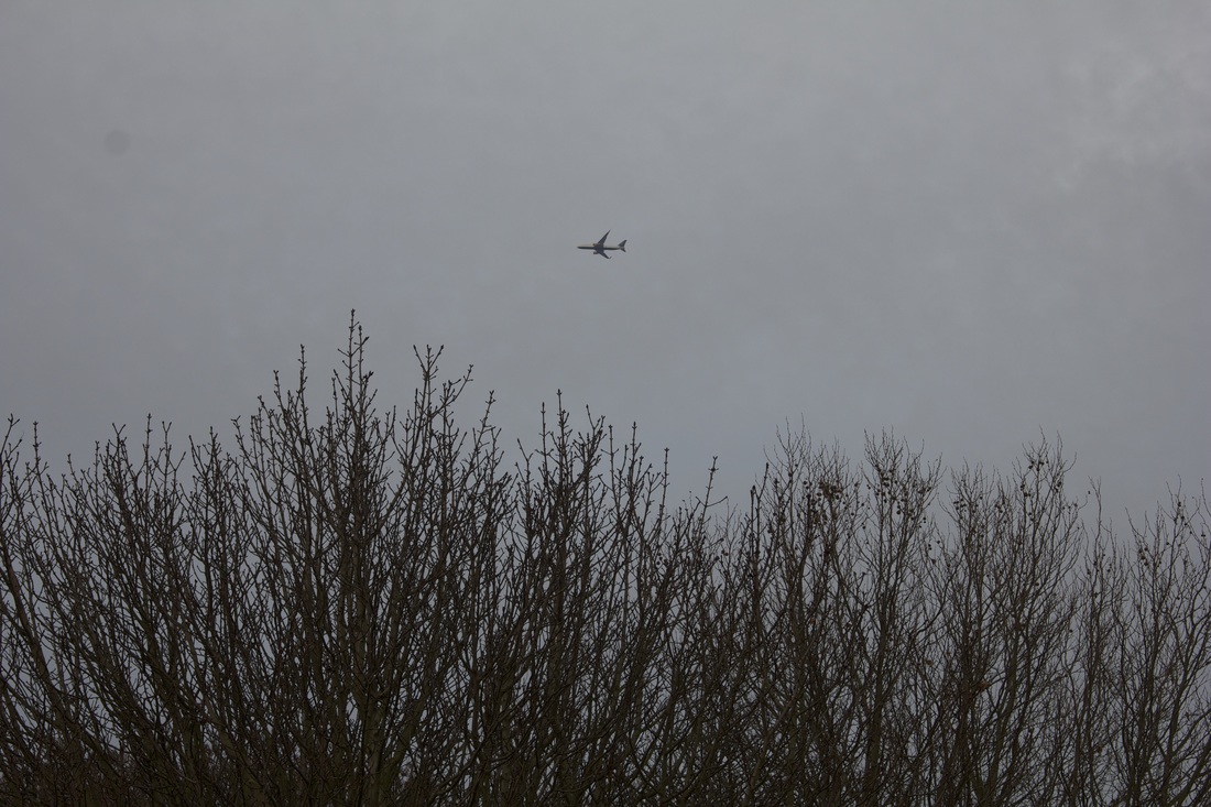
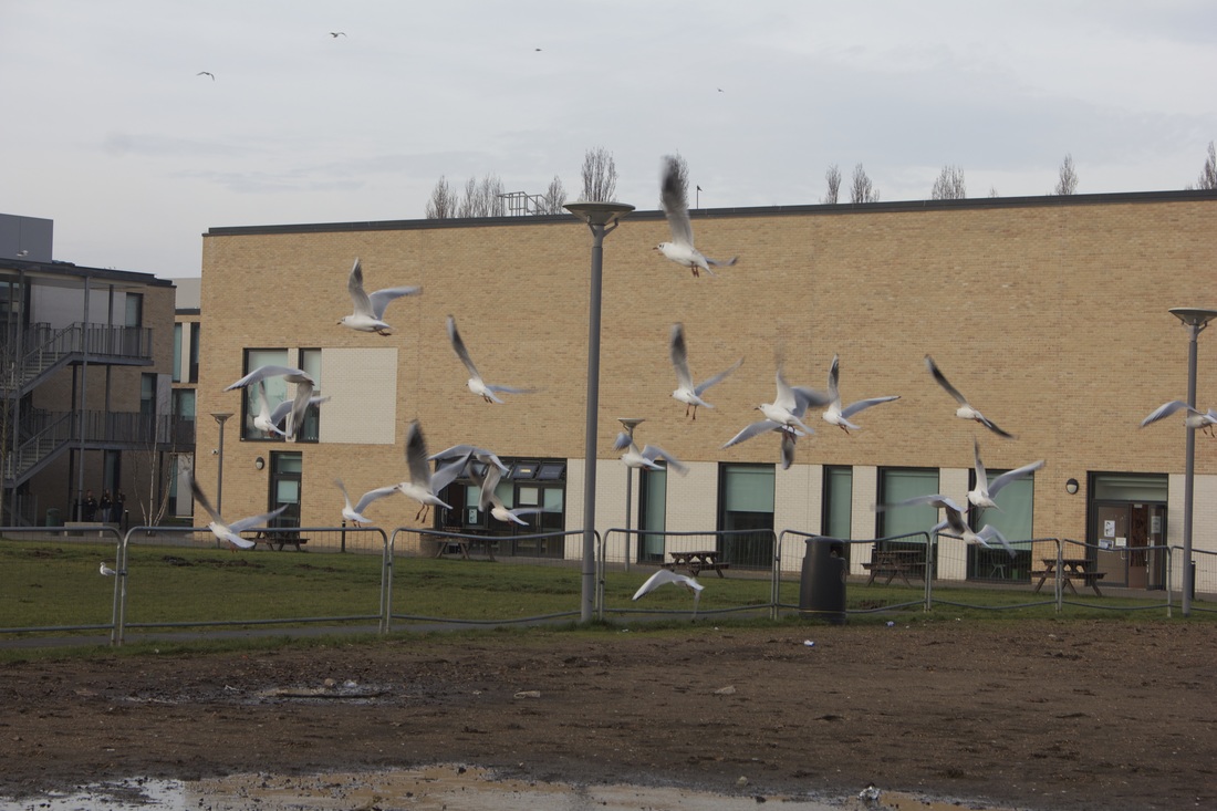
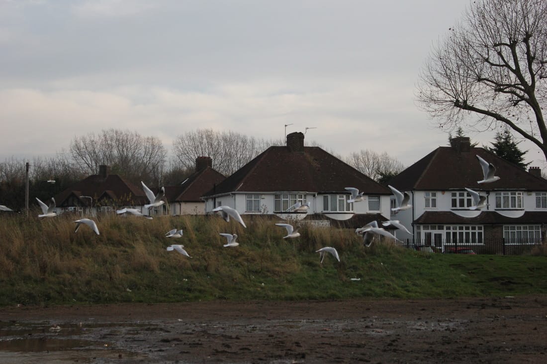
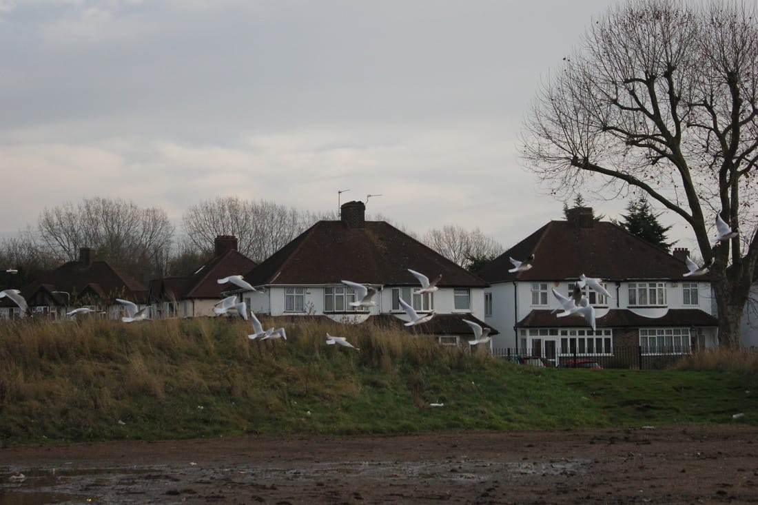
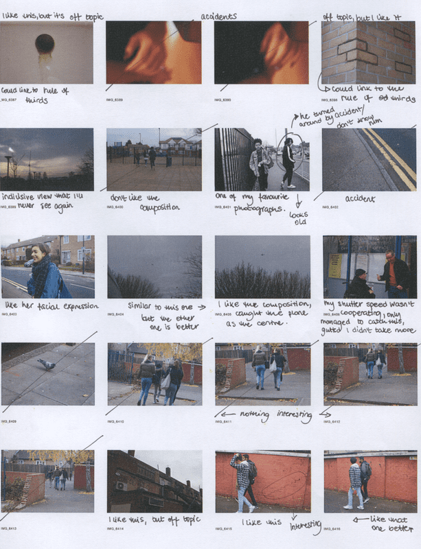
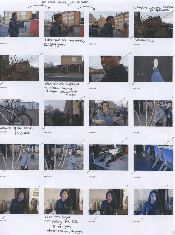
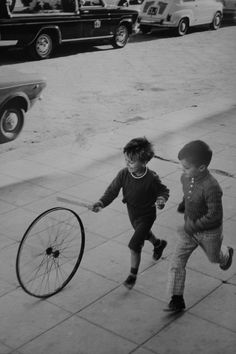
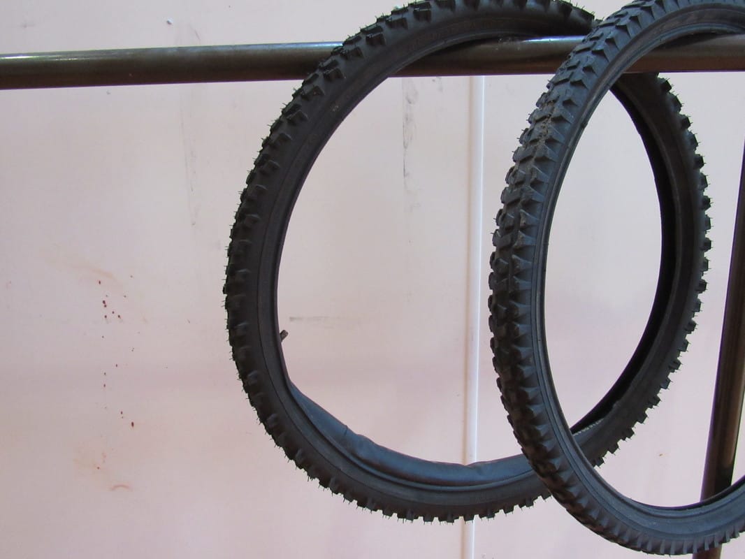
As well as going out to take pictures of a decisive moment, our task included me thinking about what I'm photographing and why I am photographing it. I had to bare in mind that the photography rules (rule of thirds, rule of odds, horizontal and vertical lines, fibionacci spiral..) had to apply to my images. For example; when i took the image of the bicycle wheels, I was thinking about the fibionacci spiral or in the image with the trees and the plane, I was thinking about the aerial perspective rule.
RESPONSE TO HENRI CARTIER BRESSON

|
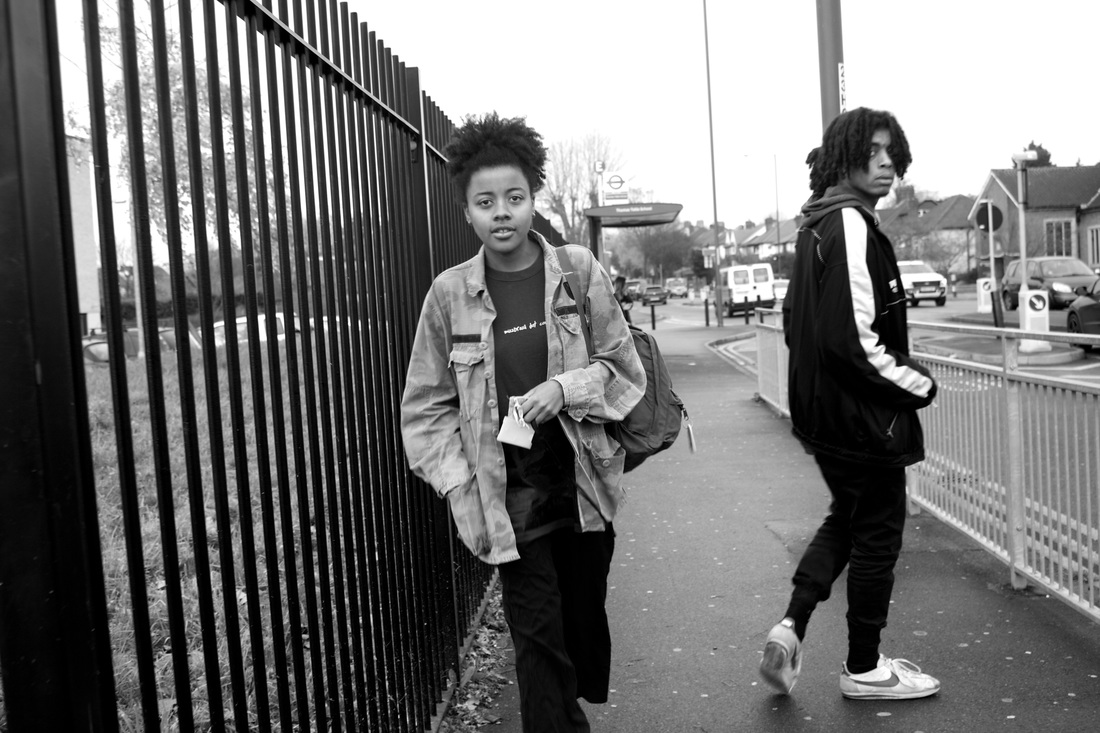
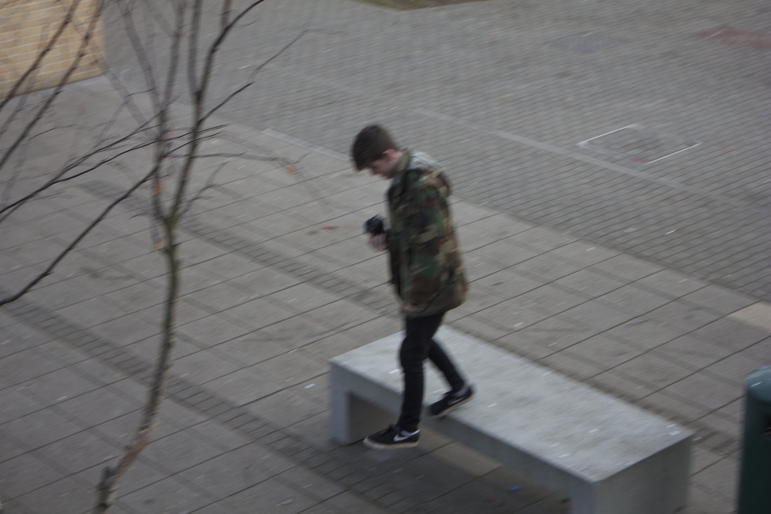
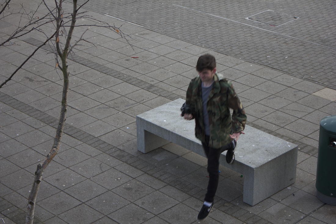
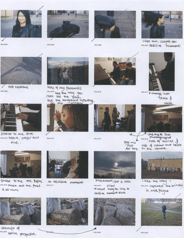
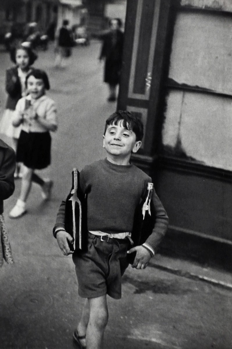
This photograph is one of my favourites and I chose it because i like the composition of it and you can tell it was a decisive moment because the main subjects are in the middle of walking. For this picture, my shutter speed was slow so I only managed to take this one photograph instead of taking loads and choosing my favourite. Although I don't have the option of picking and choosing, I am satisfied with this photograph because it was an accident but turned out to look really nice and it relates to Henri Cartier Bresson of capturing a moment that will happen only once. Before taking this photograph, I was thinking about how I will take a picture relating to the rule of thirds- the everything that is important is in the middle area and our eye is naturally drawn to that area so I would call this a successful photograph in terms of the rule of thirds.
|
EVALUATION OF THE RESPONSE TO HENRI CARTIER BRESSON
FAVOURITE HENRI CARTIER BRESSON PHOTOGRAPHS
|
Henri Cartier is a type of photographer where each and every one of his photographs is uniqie and they work amazingly by themsleves. They all have something interesting going on in them, and they all portray everydays life, but the positive side of it. Henri Cartier has had a massive impact on many succesful photographers today and he was a great example of capturing a moment that will only ever happen once. His content is interesting, he captures interesting moments and he follows the rules. I like that he photographs the working class, but through his photographs he portrays them as happy which is the truth. He supports the statement that you don't need money to be happy. He was a famous photographer during the war so with his vibrant images, he uplifted the spirits of many struggling at that time. The things that were happening in the images (facial expressions, body language...) spoke for themselves, so no colour was needed to make the images happy and ful of joy.
|
|
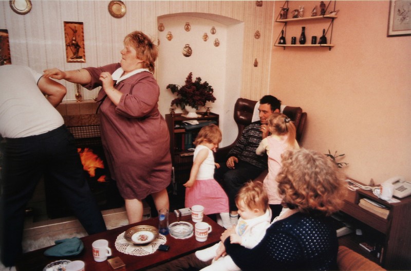
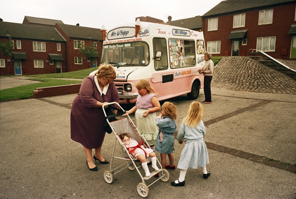
NICK WAPLINGTON- LIVING ROOM SERIES
Nick Waplington living room- took inspiration from Henri Cartier Bresson in terms of waiting and capturing the decisive moment. Besides following Henris method and technique of photography, Nick admired the way Henri captured the brighter side of things- the joy and happiness of everyday working class people. I like the way Nick developed his own style and decided to capture these moments in in colour which gives them a warm sense and it seems more happy and enhances the good sides of the working class which he wanted to present. I had an opportuinity to personally expirience Nick Waplingtons presentation and speech about his work as well as to ask questions that I wouldn't usually have a chance to ask. Thorugh the slideshow he was showing us, I thought it was interesting the way he was combining art and photography together so I asked why and how he came to that decision. He explained that he accidentaly saw the photograph infront of a piece of art he created and he thought it worked nicel together so he decided to combine them. I personally liked the way the colours complimented each other since there would be pink undertones in the photograph that would work well with a pink abstract painting that would surround the photograph.
I agree with the statement "photography is an art of selection rather that invention" because you can take a lot of photographs and you have the option to select what you like and what works best in your opinion. However, it does require the skills of invention because you have to be original with the photographs you create and you have to think outside the box in order to be a remembered photographer.
PHOTOGRAPHS FOR MY DIPTYCHS


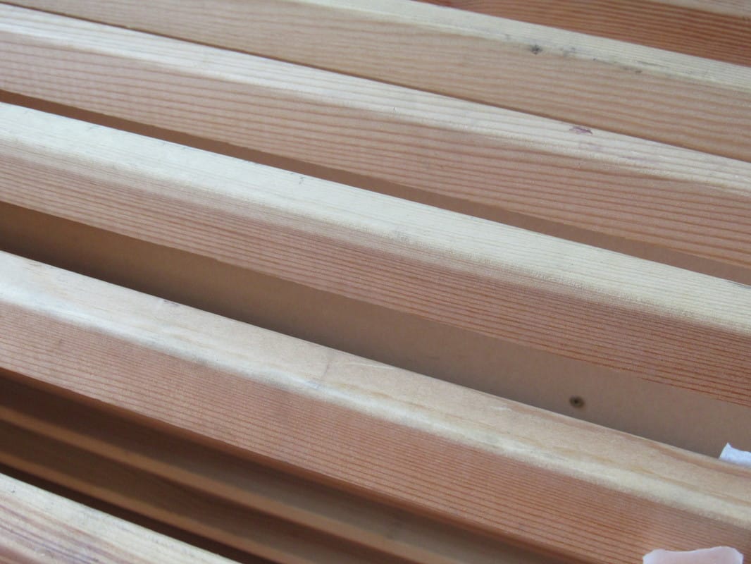
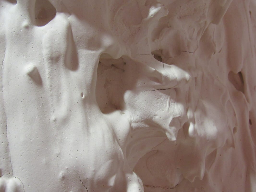
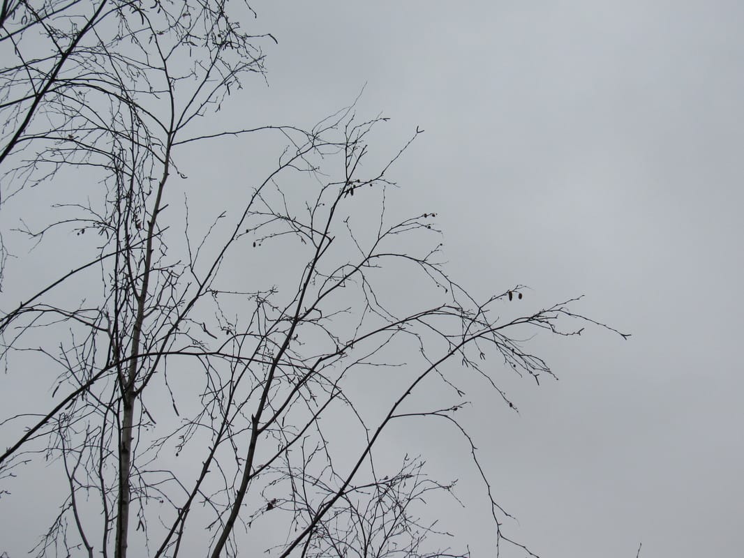
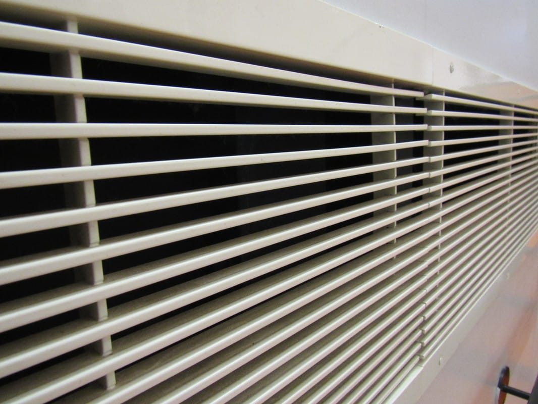


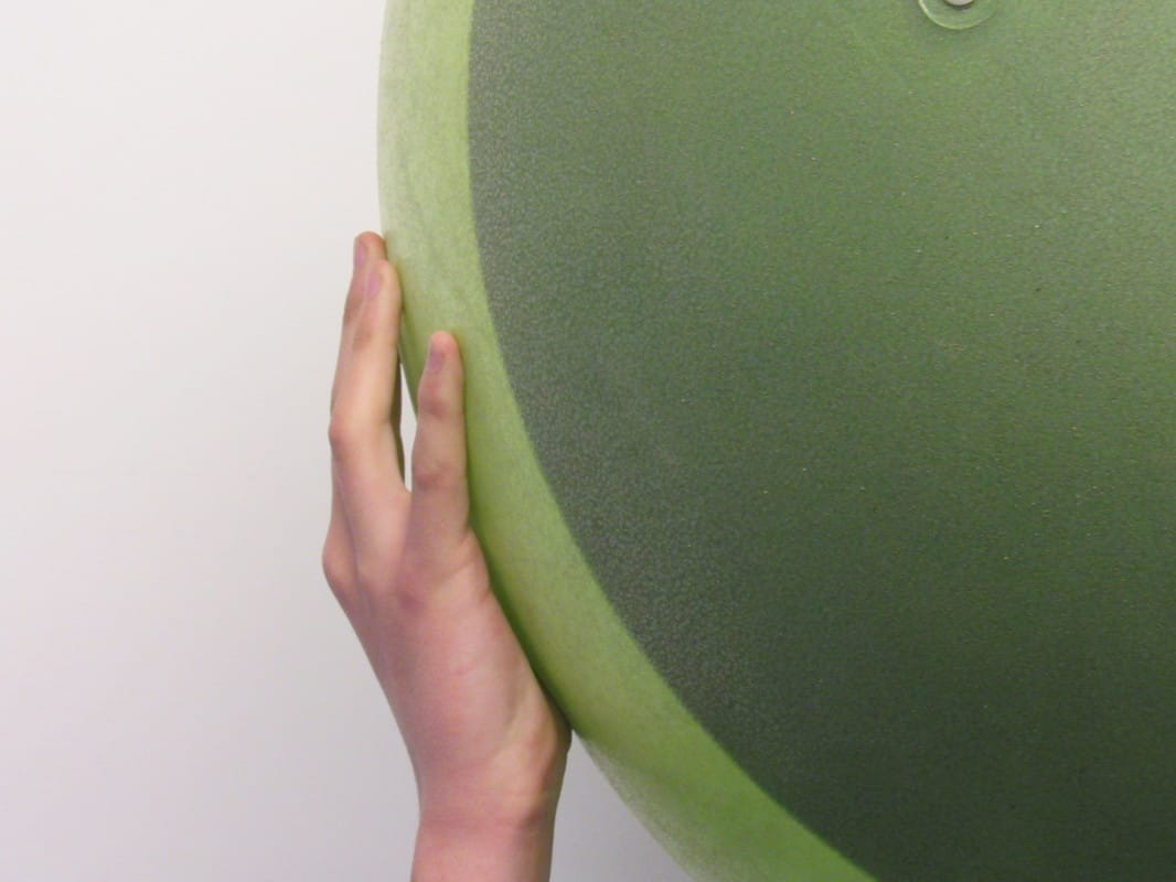
While taking these photographs, I had to think about how two pictures would go well together and diptychs work well when there is a lot of negative space in the pictures so they join together and work well as one. Personally, I don't think there is enough to photograph within the school and I would like to take this task further and photograph at a different location so I have a range a more interesting collection of diptychs because I like the concept of it and I think sometimes two photographs can work well to tell a story. Also, I was limited in term of time because I had only half an hour to think and photograph so it didn't allow me to completely think and develope my ideas but on the other hand, it made me make decisions quickly without having to think about every step thoroughly.
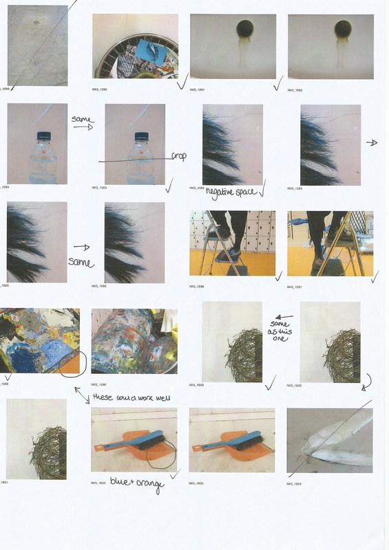
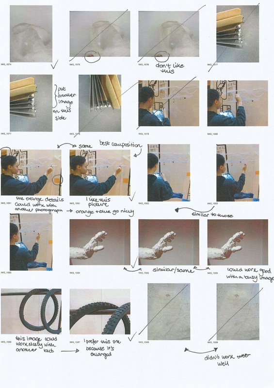
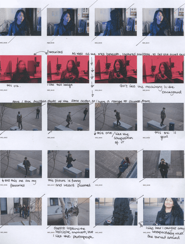
Because I had to think about what I am photographing and what it could go well with, I didn't take that many pictures, but I took a picture of the same object from a different angle. That's why there are many similar photographs and you can truly determine if a photograph is good or not when it is presented in a bigger scale, so i transferred them all to the laptop and chose the ones i felt worked best and the ones that worked well with each other.
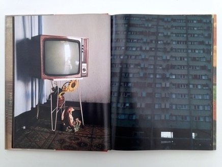
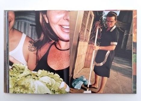
NICK WAPLINGTON- DIPTYCHS
|
I think these two images work really well together. Firstly, they are both taken from different perspectives, an internal photograph and a external one. The building of flats probably have TVs in them if I look at the diptych literally. However, I like the way they compliment each other because of the same shapes ( square TV, many square windows) and it gives it quite a satisfying geometric feel. Also, the colours work well together because of the similar deep greens and dark tones. I like the way the photograph of the building is busy and there is no negative space, however the TV picture has some negative space and therefore they work together because it isn't overcrowded. |
|
I personally don't like these photographs together. They would work better apart or combined with a different image. I understand why they might stand together- similar colours ( pinkish skin colours) and the green salad and the green trees in the background. In both images there is a woman and they are contrasting because in the first one, the woman is smiling, but in the second one, the woman is miserable and cleaning up while the other one if having fun and eating a meal with her friends. I think the images are busy and too much is happening in both of them so it isn't working well. There is no negative space and that is essential for a diptych because that allows them to join together and work as one piece overall. |
|
